Codes are taken from the above mentioned source. For more codes you may visit the kaggle website. Feel free to modify this code for your own dataset.
• We have samples from 2018-01-01 to 2021-09-21 for most of the coins. But in the case of TRON, Stellar, Cardano, IOTA, Maker, and Dogecoin we have fewer data starting from later in 2018 or even later in 2019 in Dogecoin's case.
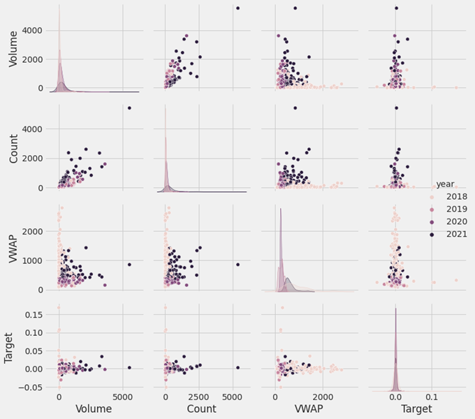
• To get an overall idea about the assets, we have distributed the data among different assets shown in Figure 1.
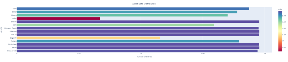
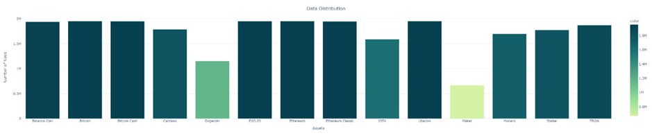
Figure 1
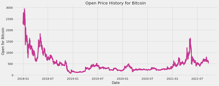
• For individual asset, we took Bitcoin as a sample asset and the test results are shown below.

• We have checked the null rows and filled the null values with zeros to ensure that there are no null values in the dataset. • To reduce memory usage, we converted the float columns to float64.
Assets Feature description: A. timestamp: All timestamps are returned as second Unix timestamps (the number of seconds elapsed since 1970-01-01 00:00:00.000 UTC). Timestamps in this dataset are multiple of 60, indicating minute-by-minute data. B. Asset_ID: The asset ID corresponding to one of the crytocurrencies (e.g. Asset_ID = 1 for Bitcoin). The mapping from Asset_ID to crypto asset is contained in asset_details.csv. C. Count: Total number of trades in the time interval (last minute). D. Open: Opening price of the time interval (in USD). E. High: Highest price reached during time interval (in USD). F. Low: Lowest price reached during time interval (in USD). G. Close: Closing price of the time interval (in USD). H. Volume: Quantity of asset bought or sold, displayed in base currency USD. I. VWAP: The average price of the asset over the time interval, weighted by volume. VWAP is an aggregated form of trade data. J. Target: Residual log-returns for the asset over a 15-minute horizon.
• This dataset has 10 unique features [Timestamp, Asset_ID, Count, Open, High, Low, Close, Volume, VWAP, Target]. To keep the dataset consistent, we have sorted the data frame by timestamp followed by Asset_ID. We have also converted the date to datetime for extracting more useful features.
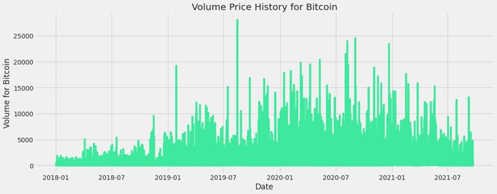
• From the line plot we had tried to extract the information about the trends and seasonality. We considered the closing price and target values for the experiment. For the sake of simplicity, we also considered the data of Bitcoin (Asset_ID =1) shown in Figure 2.
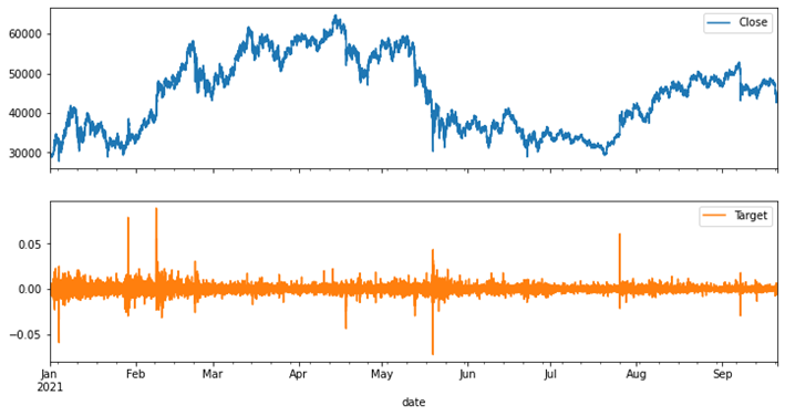
Figure 2
But the target and the feature were extremely noisy and hence we applied smoothing techniques to smoothen these curves. This might enable us to extract more valuable information from this data. The applied method to smoothen the curves was by resampling (aggregating) data over a wider period and taking the mean of these values shown in Figure 3.
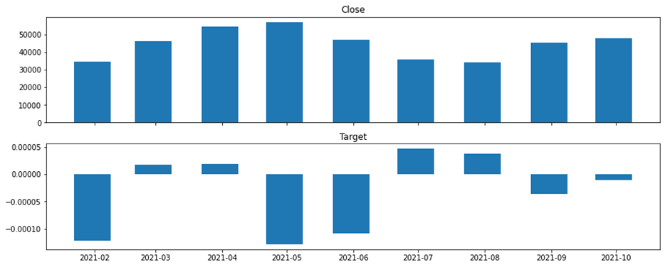
Figure 3
To explore more precious information such as median, interquartile range, outliers we have drawn the boxplots shown in Figure 4.
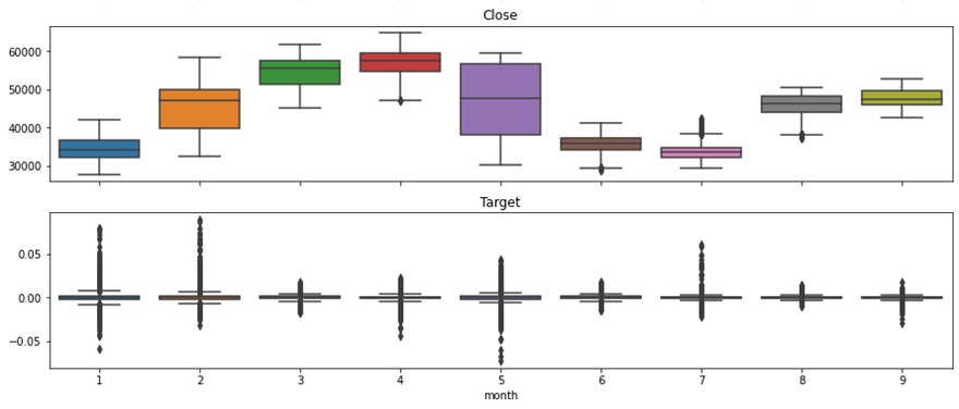
Figure 4
We have isolated the adjusted closing prices, calculated the MA (moving average) to smooth out short-term fluctuations and highlight longer-tends or cycles. Then we inspected the result, sorted the moving window rolling mean and long moving window rolling mean and plotted the adjusted closing price shown in Figure 5.
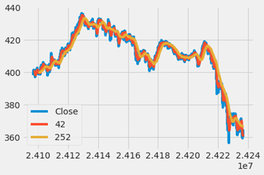
Figure 5
We also calculated the daily percentage change for DCP (daily closing price) and plot the distributions shown in Figure 6.
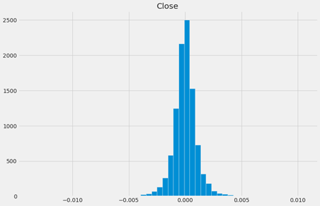
Figure 6
We have considered the minimum period is 75 and calculated the volatility shown in Figure 7.
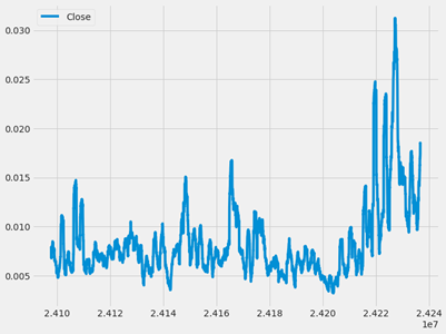
Figure 7
We also generated a heat map that enabled us to keep track of hours of all days over all months and see which hours of day has the highest mean close value and which ones has the smallest values shown in Figure 8.
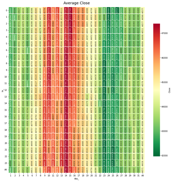
Figure 8
• To find the seasonality of the assets. We had tried to see any similarity in volatility across several years. i.e., is the volatility always high at the end of the year? The below plot does not necessarily seem to indicate any seasonal pattern like that on the first glance shown in Figure 9.
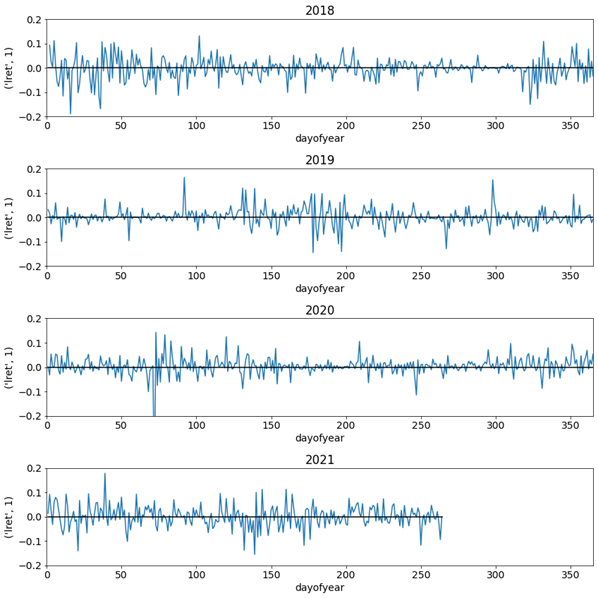
Figure 9
To find the more detail about seasonality, we also drown seasonal plots and periodogram shown in Figure 10.
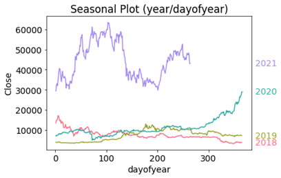
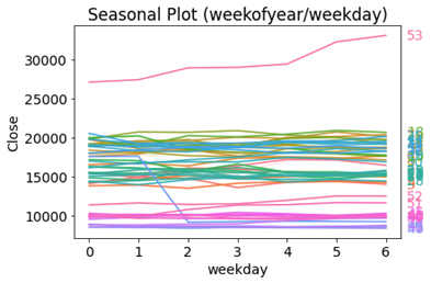
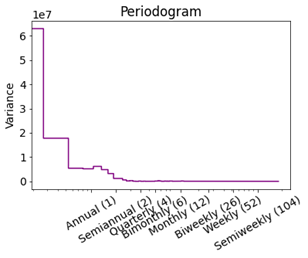
Figure 10
Neither the seasonal plots nor the periodogram suggest any strong seasonality.
• To make the time series stationary, we used the log return. To analyze price changes for an asset we dealt with the price difference. However, different assets exhibit different price scales, so their returns were not readily comparable. We solved this problem by computing the percentage change in price instead, also known as the return. This return coincides with the percentage change in our invested capital shown in Figure 11.
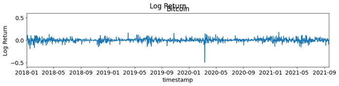
Figure 11
In the plots for the log return, we saw a negative peak around March 2020. If we had a closer look at the log return, we could see that this was the impact of the COVID-19 pandemic shown in Figure 12.
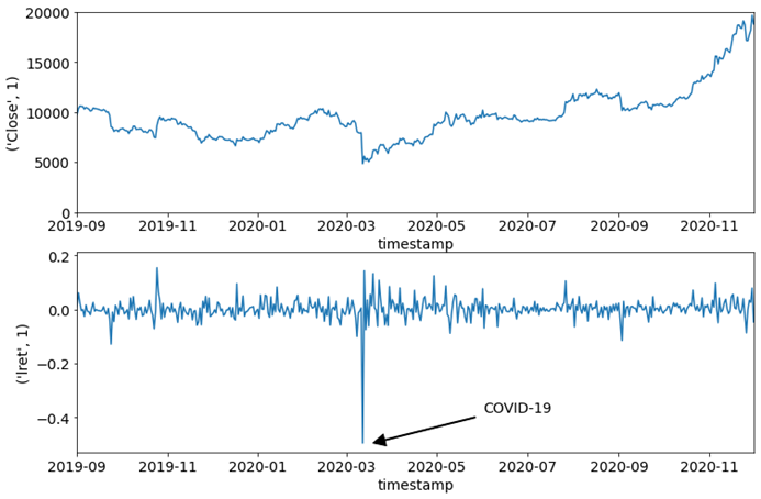
Figure 12
• Among cryptocurrency assets with substantial valuations, correlation is an on-and-off affair. Bitcoin prices have set investor and price momentum in crypto markets for most of the last decade. Lately, however, as other cryptocurrencies have garnered popularity with developers and investors, that correlation has proven difficult to maintain. For example, bitcoin prices fell even as prices for Ethereum’s ether (ETH) rose to new heights in early 2018. To find the correlation between the assets we considered Bitcoin and Ethereum. The correlation has been plot based on the closing price of both assets shown in Figure 13.
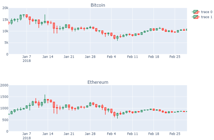
Figure 13
Furthermore, we could see that the relationship between the different coins can highly vary depending on the year shown in Figure 14.
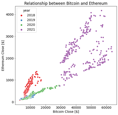
Figure 14
Note the high but variable correlation between the assets. Here we could see that there is some changing dynamics over time, and this would be critical for this time series challenge, that is, how to perform forecasts in a highly non-stationary environment.
A stationary behavior of a system or a process is characterized by non-changing statistical properties over time such as the mean, variance, and autocorrelation. On the other hand, a non-stationary behavior is characterized by a continuous change of statistical properties over time. Stationarity is important because many useful analytical tools and statistical tests and models rely on it.
We could also check the correlation between all assets visualizing the correlation matrix. Note how some assets have much higher pairwise correlation than others shown in Figure 15.
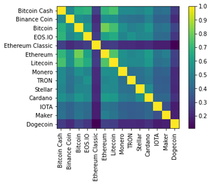
Figure 15
As part of another feature engineering, we used RatioGang shown in Figure 16. Need more explanation about RatioGang.
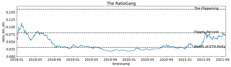
Figure 16
For most of the coins, it looks like we have a slight negative correlation at a lag of 1. For the other lags, it looks like the autocorrelations are statistically insignificant. The autocorrelation analysis helps in detecting hidden patterns and seasonality and in checking for randomness on the other hand the partial autocorrelation plays an important role in data analysis aimed at identifying the extent of the lag in an autoregressive model. Both cases it indicates that we have some Random-Walk behavior shown in Figure 17, which is going to make the prediction challenging.
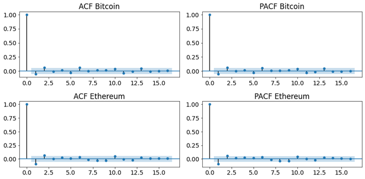
Figure 17