Updates to core, ui #458
Updates to core, ui #458
Conversation
![github-actions[bot]](https://avatars.githubusercontent.com/in/15368?s=60&v=4)
Contributes to PX-263   GitOrigin-RevId: da28e36b2b116faad819aff5b0becf240474eb90
|
The following public packages have changed files:
There are 2 existing changesets for this branch. If additional changes have been made that require different versions for any package simply add another changeset. Any packages that depend on the planned releases will be updated and released automatically in a separate PR. Each changeset corresponds to an update in the CHANGELOG for the packages listed in the changeset. Therefore, you should add a changeset for each noteable package change that this PR contains. For example, if a PR adds two features - one feature for packages A and B and one feature for package C - you should add two changesets. One changeset for packages A and B and one changeset for package C, with a description of each feature. The feature description will end up being the CHANGELOG entry for the packages in the changeset. The following releases are planned based on the existing changesets:
Last updated by commit 925f046 |
…tes (#16591)
- progress has a new design and is moved into the BridgeCardForm
- progress is dynamic depending on the integration (minimum 5 steps, otherwise adds more bars)
- the add-credentials page is hardcoded to be a step since the user isn't logged in yet
- updates CardForm with an override for top margins since there's a bunch of hard coded values
- updates Add Credentials page design
- removes the top nav/banner for most screens
- adds hover and active state to the icon with circle background component
- add logo in top left corner for desktop
- add x buttons for steps after home screen which navigates back to the home screen
- add padding for verify-identity and request email
- updated width for bridge modals
- help button on right for choose uma
- moved from BridgeFullPage to BridgeCardForm
- has multiple forms depending on which step
- updated help modal design
- addressed some design nits for verify identity and connect bank screens


GitOrigin-RevId: 1cd050066364a65e960f9d4508240b410d50e9fa
 Contributes to PX-136 GitOrigin-RevId: 41819091fde5e1f226de37bb547f2aeff7bcd7d6
 GitOrigin-RevId: ff4b069e8bc542f27aff41417e1b8796fba2b637
# Updated Password Reset Flow to Support Phone and Email This PR updates the password reset flow to support both email and phone number verification methods. It includes several key changes: - Modified the `ResetPasswordInput` type to use `identifier`, `identifier_type`, and `token` instead of `email` and `email_token` - Updated the `RequestPasswordResetMutation` to return delivery method and target information - Enhanced the UI for password reset requests with separate flows for email and phone verification - Added support for multi-login enabled accounts to choose between phone or email for password reset - Improved the CardForm component with new styling options and better layout control - Updated the BridgeCardForm component to use Icon instead of IconWithCircleBackground for better visual consistency - Added stretch configuration to CardFormBottomContent for flexible layouts - Updated the reset password confirmation page to handle both email and phone token verification These changes align the password reset flow with the frontend design and provide a more flexible authentication experience. Mockups:   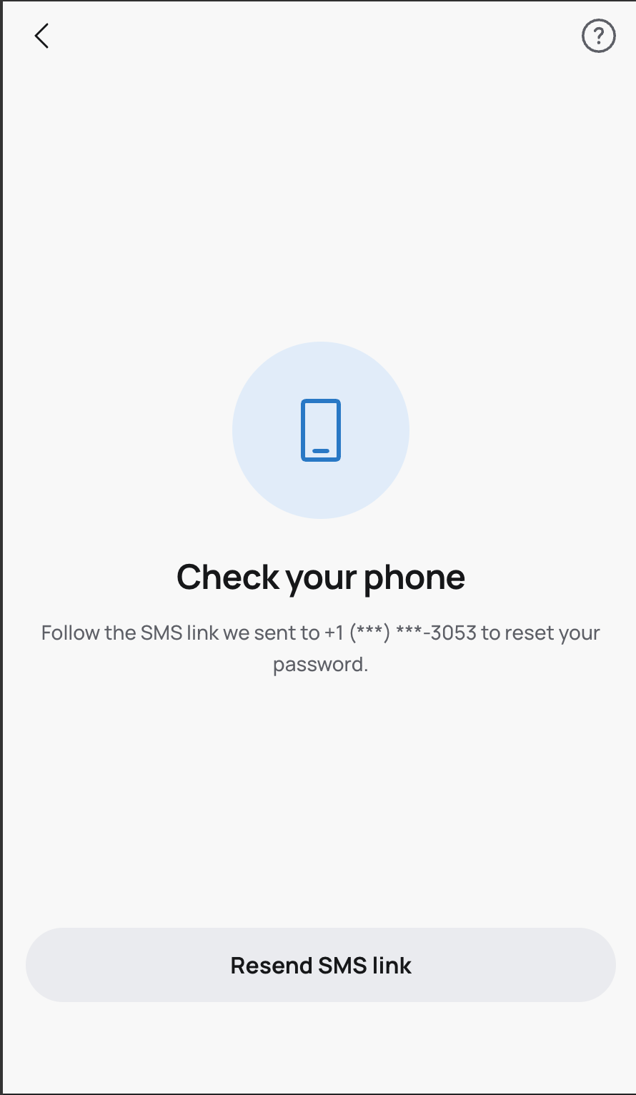 GitOrigin-RevId: 530c84149b5122a28c5aac6b441362ead0d48d32
    GitOrigin-RevId: 83943620283ae0942523d9771272ac00b03ac725
# provide a more correctly styled 3a kyc page + language strings we're negotiating about if we even need this page, but until then, here's the styling closes PX-343 & PX-169 | Design | Impl | |----------|----------| | 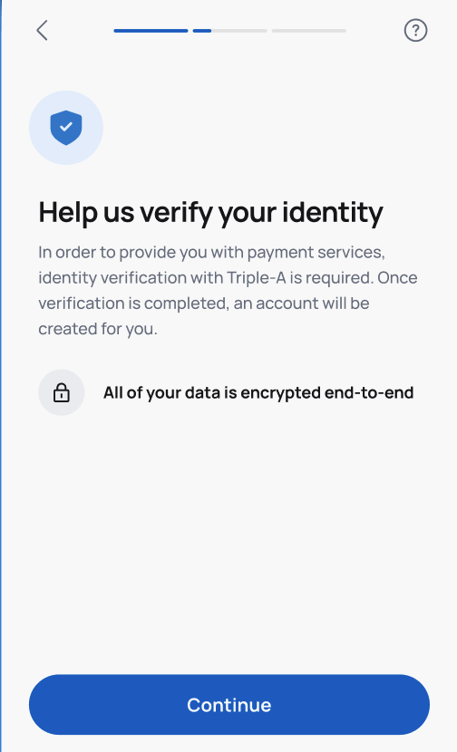 | 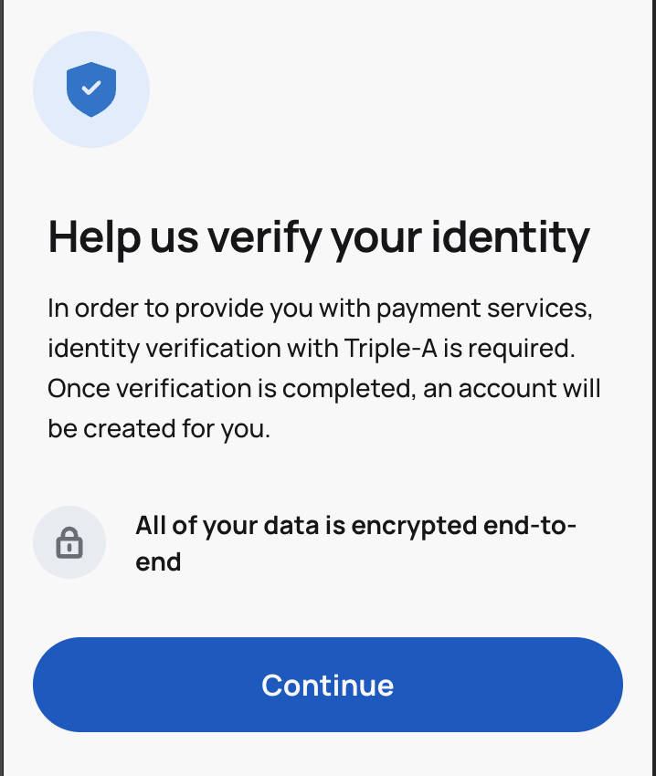 | GitOrigin-RevId: f2fb2523aa9a6bb55f55cfb2fe904c3e9cd1fc4c
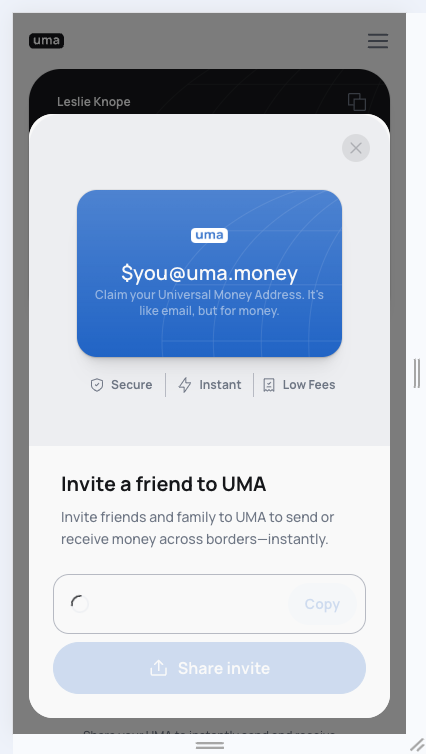
### TL;DR Enhanced the empty state for the transaction list with a "Share UMA" call to action. ### What changed? - Redesigned the `NoTransactions` component to include: - Skeleton profile images - A blur gradient overlay - A "No activity, yet" message with descriptive text - A "Share UMA" button that uses the `useShareUma` hook - Added new translation strings for "No activity, yet", description text, and "Share UMA" button - Adjusted the styling of the skeleton containers to better match the design - Modified the Small button padding in the bridge theme from 13px to 8px  GitOrigin-RevId: ac10a3cede09ead632a55043097e36536d053eef
# fix 3a link bank

there were some styling and language string issues with linking 3a bank accounts
this pr fixes up the style elements and adds string translations

GitOrigin-RevId: 7dd4ca797b21a901c71f1dd1343b404a17d56fac
GitOrigin-RevId: 6a3c007d8341d2c90a6fcc5ea0ca0e7cc53e1532
…utofocus (#16866)

This PR:

- Removes autofocus on send page for send demo release
- Adds lock icon to finish setup buttons for new design
- Removes finish setup button from Send autopop modal once fully onboarded
- Removes Us2Mx invite container until the user is fully onboarded
- Adds required onBlur login to multiinput

GitOrigin-RevId: 5d1e24ddca69a2970b31876475477e50196bd991
* [sparkcore] Validate ui logs input with pydantic

* use TypeError instead of ValueError

* fix type

* fix pyre

* fix sort

* rename to objectToJSON, pass stringifyObjects true from logger

* pass stringifyObjects in initAccount

* fix core build

* remove window debug

* fix parent method not callable

GitOrigin-RevId: 4d5c237cf4a255a01eb1b9e74f2d708d13228731
# Updated UI for reset password This PR enhances the password reset functionality by: 1. Adding a `LoginMethod` enum to replace string literals for identifier types (`EMAIL`, `PHONE`) 2. Implementing password validation for the Bridge app with specific requirements (10+ characters) 3. Adding a password confirmation field with matching validation 4. Improving the UI for the password reset flow with better error messages and validation feedback 5. Updating the backend password validation logic to support different requirements based on user type 6. Adding visual indicators for password validation status (success/error states) 7. Enhancing toast notifications with support for success/error/info types The changes ensure a more consistent and user-friendly password reset experience across the application.        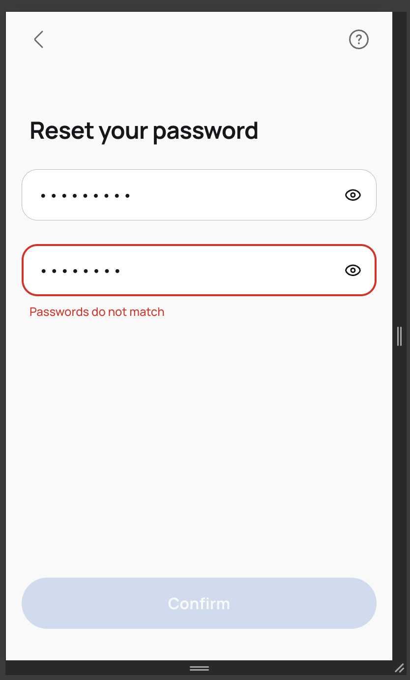   GitOrigin-RevId: b7ec16c4ffc14d94873343526eebd633ab654b9c
…vent (#16967)

GitOrigin-RevId: 5dd9012692a2e31df338957209c351173ed91e05
GitOrigin-RevId: cb1812853d4c35aa23801551963bdb01d1f1d5d5
[ui] Only set fields when default fields actually changes

GitOrigin-RevId: 431f045cfbfbab1338b95373a381985a2c84dab6
…(#16998)

Revert "[bridge] temporarily fix infinite render bug with useFields (#16992)"

This reverts commit cb1812853d4c35aa23801551963bdb01d1f1d5d5.

GitOrigin-RevId: 59dc9acdb4528f0a640bdf16bc74e82c6e14b8d8
Contributes to PX-148. Has built in validation same as the PhoneInput. Uses react-phone-flags for this. This PR: - Adds react-phone-flags package - Removes unused select field in ListItem (my bad) - Adds option to pass in a ReactNode for ListItem image - Makes ListItem description optional - Replaces existing PhoneInput with CountryCodeSelector + TextInput   GitOrigin-RevId: b5014850b4552bb44eb69ced2b6388e58e533233
…elds (#17015)

GitOrigin-RevId: 0c519d6b0720d1ae1a7a2e936bc6219dd1b2a205
Got Pat's sign off on this one 🙏 This PR: - Adds fade in and out animations to country code selector - Adds new medium padding between TextInput icon and placeholder - Adds option to fix drawer to bottom of the screen & set a max height - Makes all bridge modals with drawer smKind fixed to the bottom (I THINK THIS IS RIGHT? LMK)     GitOrigin-RevId: 2a0f4b7e55da06631960111d7dfd9c2cb1e707ff
… (#17020) - fixes paddings and margins in various screens - redirects to email verification step from activate uma step so it doesn't show an error when attempting to navigate to the verify-identity step too early     GitOrigin-RevId: 927703ed10ce1874dea6c754af82762adc368ff5
…022)

* [bridge] Move flag SVGs to app and remove react-circle-flags dep

* fix

GitOrigin-RevId: f8dfa429d321bccb45924edfc674c25731296fcd
GitOrigin-RevId: 00d014e5b2fc3f95d9e8147595c7035507c4370f
### TL;DR Added email update functionality to the UMA Bridge app, allowing users to update their email address and verify it. ### What changed? - Added a new `UpdateEmail` page component with corresponding route - Updated GraphQL mutation from `update_user_email` to `update_logged_in_user_email` for consistency - Enhanced the email verification flow with new modals for "Didn't receive email" and "Open email app" options - Added email client icons (Gmail, Outlook, Apple Mail) to help users open their email apps - Added new language strings for the email update and verification flows - Created a new `ImageIcon` component for displaying email client icons - Improved the UI of the email verification page with better spacing and layout  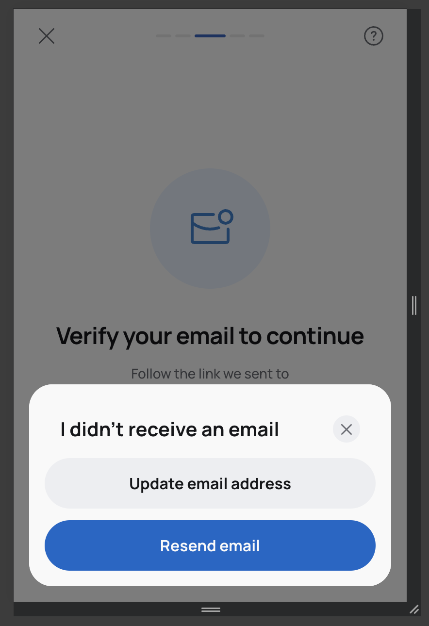     GitOrigin-RevId: ced428a41e10dfb717ff06819bec83c0ab6ac939
This PR:

- Removes the ability to scroll on the CountryCodeSelector
- Makes it smaller for mobile to take into account keyboard
- Removes drawerHeight from drawer as its not needed anymore
- Allows the user to press enter and select the first country in the list

GitOrigin-RevId: f02da607486811bce0db92eb98472769cac2041b
GitOrigin-RevId: f21173aca21eb96b5d853224cc9617b854bb6618
GitOrigin-RevId: 32a7a3e99c90a80b78176e5caff27bf2c2cc5eef
# Added CLABE Account Details Collection for Mexican Bank Transfers This PR implements the UI for collecting recipient CLABE account details when sending to Mexican bank accounts. Key changes include: - Added new translations for CLABE-related fields and instructions - Implemented the `CollectClabeReceiverData` component with form validation - Added support for entering recipient's legal name and CLABE number - Connected the CLABE collection flow to the main receiver data collection process - Updated the `getReceiverUmaAddress` function to handle CLABE addresses - Added CLABE validation to the `useFields` hook The implementation follows a step-based approach for collecting recipient information, with proper validation for the 18-digit CLABE format.  GitOrigin-RevId: 9d35503aeae2a3f7dba2b5cb99ce5e9b62d1653a
* [bridge] New start using UMA page

* fixes

GitOrigin-RevId: d9461988a2ef02c2395509cc60623272883dd0a9
### TL;DR

Removed `checkFieldForError` from the return object in `useFields` hook.

### What changed?

Removed the `checkFieldForError` function from the object returned by the `useFields` hook. This function was previously exported alongside other field-related utilities like `blurredFields`, `getUpdateField`, `allFieldsValid`, and `fieldErrors` however using it caused infinite rendering issues because it calls setFieldErrors within it.

GitOrigin-RevId: fb7ff01ca6adea82720d0b62838d363e7f8f0dfe
* [site, docs] Update to new logo

* more

* fix

GitOrigin-RevId: 9801df67d5315618607363320b64aceefea7975a
### TL;DR Enhanced the NationalitySelector component with country flags and improved styling for a better user experience. ### What changed? - Added country flags to the NationalitySelector dropdown options - Improved styling of the NationalitySelector component: - Added proper border radius (16px) - Set border color to #B6BAC3 - Set border width to 0.5px - Created a styled RegionLabel component to properly align flags with country names - Added a new `selectMarginTop` prop to the CardForm component to allow customization of select element spacing - Applied the new `selectMarginTop` prop in the CollectClabeReceiverData component to improve layout - Added proper margin to the continue button in CollectClabeReceiverData  GitOrigin-RevId: 172ce283e29d4069a2e8ac3631fa54b8a6e0ce0c
GitOrigin-RevId: dffad37a6c15c4a7598370f324d3f84a8b0f8b02
* [site, docs, ops, oauth-app] Update favicons and manifest files

* docs and remove 48x48

* ui test app

* issuance

GitOrigin-RevId: dc855b3f7584a4282eb8442a9b6a696f30abfaa9
   GitOrigin-RevId: ef4aff5b64411ca37f68d79006386e9b505e32b3
GitOrigin-RevId: 4dc181d0c35fa4adda5d00d102b940c0a185ffb0
 GitOrigin-RevId: 6c7eef5c3e88b876cbc52e2d120b4aadeab8e93e
### TL;DR Added a `titleMarginLeft` prop to the CardForm component to allow customizing the left margin of the title. ### What changed? - Added a new `titleMarginLeft` prop to the `CardForm` component with a default value of 0 - Updated the `CardHeadline` styled component to apply the left margin when the prop is provided - Implemented the new prop in the `InputReceiverTypeStep` component with a value of `Spacing.xs`  GitOrigin-RevId: 1b9d99c53fb3da5f5233869513b313b3fa69c815
- shows header w buttons if the user is on desktop - allows user to horizontal scroll manually - looks for query params to determine input receiver type when on SplitSend page - links directly to clabe flow from "Send to a mexican bank" card in the carousel - should probably have more precise links to the demo - adds paddingX to cardform and bridgecardform because the carousel needs to go up to the edges of the form - adds smDontAdjustWidth bc there's common styles in cardForm that make the width smaller, which make it impossible for the carousel to go up to the edges of the form [Screen Recording 2025-05-05 at 8.30.51 AM.mov <span class="graphite__hidden">(uploaded via Graphite)</span> <img class="graphite__hidden" src="https://app.graphite.dev/api/v1/graphite/video/thumbnail/NU8OmLauzLqa61yWDJkY/4e7ee5a8-5e6c-4f8b-80aa-b05a57d29219.mov" />](https://app.graphite.dev/media/video/NU8OmLauzLqa61yWDJkY/4e7ee5a8-5e6c-4f8b-80aa-b05a57d29219.mov)  GitOrigin-RevId: edd145dff38e50b03deb210eed715443a5942f21
### TL;DR

Added support for customizable stroke width in TextInput icons.

### What changed?

- Added a new `strokeWidth` property to the icon configuration in TextInput component
- Introduced `iconStrokeWidths` array with values `[1, 1.5, 2]` and corresponding type
- Extended the icon width options to include `20` as a valid width
- Updated the Icon component usage to pass the strokeWidth to iconProps
- Applied these changes in the CLABE receiver data form by setting the question mark icon to have width 20 and strokeWidth 1.5

GitOrigin-RevId: 154b81051b87eeadcbcf4648d406ee693d653901
GitOrigin-RevId: 07d38ae544a240696cc68bcf34ef30dd6ee5e60b
### TL;DR Added a new promotional carousel item offering $20 USD for first-time transactions to Mexico. ### What changed? - Added a new promotional carousel item that displays "Get $20 USD" for users in ZH who have Send2Clabe enabled - Created a new modal that appears when users click on the promo item, explaining the promotion details - Added new translations for the promo content in English, Spanish, and Portuguese - Added a new "CentralGift" icon to support the promo UI - Added a new "green37" button kind for styling - Added support for custom background and text colors in carousel item icons - Added a new promo graphic image   GitOrigin-RevId: f8ff1108c3a6a469fa208719e9bded699d316969
GitOrigin-RevId: 1e32d72a38ea14aa9f69d009c6752305a934494a
GitOrigin-RevId: 854efcc6c3fc67a199329cb1eca0439e0c20bd04
- `getLocalStorageBoolean` would evaluate to false if the key is not set in local storage. This falsy value results in the GK to always act as a fallback. Even if you set the storage key to "0", it returns false, and falls back to the GK.
- Fix this by returning either true, false, or null. Null indicates that the key is not set. Only in the scenario where the local storage key is NOT set, do we fallback to the GK. Otherwise, use the local storage setting as the higher priority.

GitOrigin-RevId: 87b6ac4a9a00f1567ce737aaffcbc90f4c244e7c
* [core] Async init Requester wsClient

* try/catch err

* fix log

GitOrigin-RevId: 1a9f051217a2a75369c55afdec3750e9c69a5f73
 coreymartin
changed the title
coreymartin
changed the title
If this change should result in new package versions please add a changeset before merging. You can do so by clicking the link provided by changeset bot below.