

Simple, fully customizable React tabs component that can be used in plain React application or with any Flux-like architecture with external application state, e.g. Redux.
- We've changed the Module to work with Foundation 6 Stylings.
Using npm:
$ npm install react-tabs-redux
UMD build is also available:
<script src="https://unpkg.com/react-tabs-redux/dist/react-tabs.min.js"></script>with components accessible via window.ReactTabs object.
NOTE: This component requires React to be installed separately.
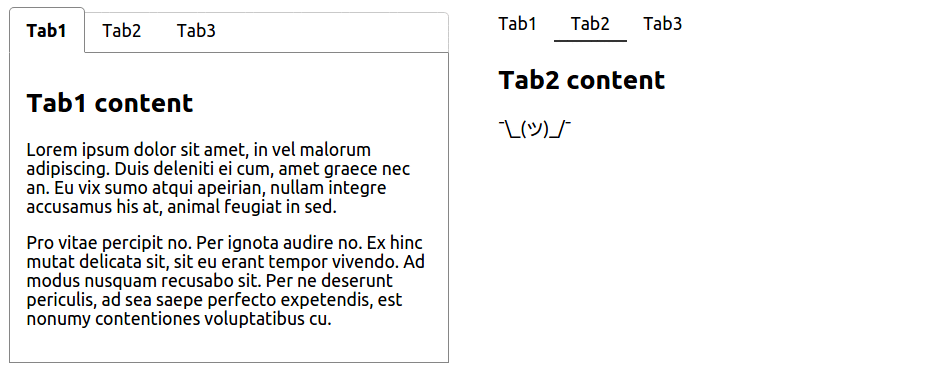
- with plain React (using component's internal state) - see example
<Tabs>
    <TabLink to="tab1">Tab1</TabLink>
    <TabLink to="tab2">Tab2</TabLink>
    <TabLink to="tab3">Tab3</TabLink>

    <TabContent for="tab1">/* content for tab #1 */</TabContent>
    <TabContent for="tab2">/* content for tab #2 */</TabContent>
    <TabContent for="tab3">/* content for tab #3 */</TabContent>
</Tabs>- with Redux (or any other external state management library) - see example
The only change needed from plain React example is to provide handleSelect and selectedTab (name as well if you want to have multiple <Tabs /> instances in your app) props to <Tabs /> component so that you are able to save and retrieve information about which tab is currently active from your external application state.
<Tabs
    /* namespace for this <Tabs /> instance so you can keep track of
       multiple <Tabs /> instances in your external state */
    name="tabs1"
    handleSelect={(selectedTab, namespace) => {
        // fire Redux action here
    }}
    /* selected tab name retrieved from external state */
    selectedTab="tab2"
>
    <TabLink to="tab1">Tab1</TabLink>
    <TabLink to="tab2">Tab2</TabLink>
    <TabLink to="tab3">Tab3</TabLink>

    <TabContent for="tab1">...</TabContent>
    <TabContent for="tab2">...</TabContent>
    <TabContent for="tab3">...</TabContent>
</Tabs>
By default, the first <TabLink /> component is set to active. You can change this by specifying default in props of the <TabLink /> component you want to become active instead.
<Tabs>
    <TabLink to="tab1">Tab1</TabLink>
    <TabLink to="tab2" default>Tab2</TabLink>
    <TabLink to="tab3">Tab3</TabLink>

    <TabContent for="tab1">...</TabContent>
    <TabContent for="tab2">...</TabContent> // this gets visible
    <TabContent for="tab3">...</TabContent>
</Tabs>
<TabLink /> and <TabContent /> don't need to be first level children of <Tabs /> component. You can put them as deep in your markup as you need to (e.g. because of styling) making <Tabs /> component fully customizable.
This will work then:
<Tabs>
    <ul>
        <li><TabLink to="tab1">Tab1</TabLink></li>
        <li><TabLink to="tab2">Tab2</TabLink></li>
        <li><TabLink to="tab3">Tab3</TabLink></li>
    </ul>

    <div>
        <TabContent for="tab1">...</TabContent>
        <TabContent for="tab2">...</TabContent>
        <TabContent for="tab3">...</TabContent>
    </div>
</Tabs>
See more in examples
There is couple of class names dynamically added to the components.
<TabLink /> will receive tab-link class name with tab-link-active added when tab is active.
/* will receive `className="tab-link"` in props */
<TabLink to="tab1">Tab1</TabLink>

/* will receive `className="tab-link tab-link-active"` in props */
<TabLink to="tab2" default>Tab1</TabLink>
<TabContent /> will receive tab-content class name with tab-content-visible added when the content is visible (its corresponding <TabLink /> is active).
/* will receive `className="tab-content"` or `className="tab-content tab-content-visible"` in props */
<TabContent for="tab1">...</TabContent>If you prefer to use inline styles, you can set style in props of each of <Tabs />, <TabLink /> and <TabContent /> components.
To apply style for an active tab link, set the style as activeLinkStyle in props of <Tabs /> component.
To apply style for a visible tab content, set the style as visibleTabStyle in props of <Tabs /> component.
<Tabs
    style={/* styles for tabs wrapper */}
    activeLinkStyle={/* style that will be applied on the active `<TabLink />` */}
    visibleTabStyle={/* style that will be applied on the visible `<TabContent />` */}
>
    <TabLink to="tab1" style={/* styles for inactive tab link */}> Tab1 </TabLink>
    <TabLink to="tab2" style={/* styles for inactive tab link */}> Tab2 </TabLink>

    <TabContent for="tab1" style={/* styles for tab content */}>...</TabContent>
    <TabContent for="tab2" style={/* styles for tab content */}>...</TabContent>
</Tabs>
In each example there is one <Tabs /> components styled using class names and the other one styled using inline styles.
MIT