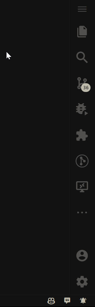
From the beginning, this project was the result of the desire to build an extension that delivered the basics of an initial development kit. From the appearance of Visual Studio Code, through the icon themes and finally applying a text source focused on developers to text editors. However, the objectives have climbed considerably and other incorporations were added to Flawuldragon, built by the community throughout the life of the VS Code. Very optimisticly, many users will choose to use this extension when with this work environment installed. In the current state of the project, it has many useful tools such as content highlights, product themes, icon themes, appearance and other available utilities.
| Key Shortcut | Source | Action |
|---|---|---|
Alt + N |
Vanilla | Open Flawuldragon Infos |
Alt + D A |
Vanilla | Set American Date Format |
Alt + D B |
Vanilla | Set 12h Time Format |
Alt + D C |
Vanilla | Invert Date and Time Properties |
Alt + D D |
Vanilla | Switch Visibility Date or Time |
Alt + D E |
Vanilla | Show Seconds |
Alt + D F |
Vanilla | Show Day of Week |
Alt + D G |
Vanilla | Interruptor Vanilla DateTime Status Bar |
Alt + A A |
Vanilla | Enable Inlay Hints |
Alt + A B |
Vanilla | Set Inlay Hints Font Family |
Alt + A C |
Vanilla | Set Inlay Hints Font Size |
Alt + A D |
Vanilla | Line Has Error Signal |
Alt + A E |
Vanilla | Line Has Warning Signal |
Alt + A F |
Vanilla | Line Has Inline Suggestion Signal |
Alt + J |
Jetbrains Mono | Activate JetBrains Mono Font |
Alt + J D |
Jetbrains Mono | Deactivate JetBrains Mono Font |
Alt + T L |
Theme Switch | Switch to Light Theme |
Alt + T D |
Theme Swtich | Switch to Dark Theme |
Alt + T T |
Theme Switch | Toggle Theme |
Alt + C L |
Auto Close Tag | Enable/Disable Auto Close Tag |
Alt + P |
Bracket Pair Guides | Enable/Disable Toggle Bracket Pair Guides |
Alt + E |
ErrorLens | Enable/Disable Error Lens |
Alt + E E |
ErrorLens | Enable/Disable Error Lens Errors |
Alt + E W |
ErrorLens | Enable/Disable Error Lens Warnings |
Alt + E I |
ErrorLens | Enable/Disable Error Lens Infos |
Alt + E H |
ErrorLens | Enable/Disable Error Lens Hints |
Alt + E M |
ErrorLens | Error Lens Toggle Inline Message |
Alt + E S |
ErrorLens | Error Lens Search for Problem |
Alt + E N |
ErrorLens | Error Lens Select Problem |
Alt + E P |
ErrorLens | Error Lens Toggle Workspace |
Alt + E C |
ErrorLens | Error Lens Disable Line |
Alt + E X |
ErrorLens | Error Lens Find Linter Rule Definition |
Alt + E A |
ErrorLens | Error Lens Copy Problem Message |
Alt + E B |
ErrorLens | Error Lens Copy Problem Code |
Alt + Q |
Take a Break | Start Take a Break |
Alt + Q T |
Take a Break | Stop Take a Break |
Alt + V V |
HTML CSS Support | Validate HTML CSS |
Alt + V C |
HTML CSS Support | Clear HTML CSS |
All the following information has been taken directly from the original READMEs projects with modifications.
Automatically add HTML/XML close tag, same as Visual Studio IDE or Sublime Text does.
- Automatically add closing tag when you type in the closing bracket of the opening tag
- After closing tag is inserted, the cursor is between the opening and closing tag
- Set the tag list that would not be auto closed
- Automatically close self-closing tag
- Support auto close tag as Sublime Text 3
- Use Keyboard Shortcut or Command Palette to add close tag manually
After typing in the closing bracket of the opening tag, the closing tag will be inserted automatically.
To add close tag manually, use shortcut
Alt+.(Command+Alt+.for Mac), or pressF1and then select/typeClose Tag
To automatically add close tag when
</is typed (same as Sublime Text 3 does), set the below config astrue:{ "fd.auto-close-tag.SublimeText3Mode": true }The setting is
falseby default.
Use
fd.auto-close-tag.enableAutoCloseTagto set whether to insert close tag automatically (it istrueby default):{ "fd.auto-close-tag.enableAutoCloseTag": true }To set whether to close self-closing tag automatically (e.g. type
<br, then type/,>will be added automatically) (it istrueby default):{ "fd.auto-close-tag.enableAutoCloseSelfClosingTag": true }Whether to insert a space before the forward slash in a self-closing tag (it is
falseby default):{ "fd.auto-close-tag.insertSpaceBeforeSelfClosingTag": false }Add entry into
fd.auto-close-tag.activationOnLanguageto set the languages that the extension will be activated. Use["*"]to activate for all languages. Below are the default settings:{ "fd.auto-close-tag.activationOnLanguage": [ "xml", "php", "blade", "ejs", "glimmer-js", "glimmer-ts", "jinja", "javascript", "javascriptreact", "typescript", "typescriptreact", "plaintext", "markdown", "vue", "liquid", "erb", "lang-cfml", "cfml", "HTML (Eex)" ] }Note: The setting should be set with language id defined in VS Code. Taking javascript definition as an example, we need to use
javascriptfor.jsand.es6, usejavascriptreactfor.jsx. So, if you want to enable this extension on.jsfile, you need to addjavascriptin settings.json.Alternatively you could also exlude the languages where you don't want the extension to be activated. Below is an example:
{
 "fd.auto-close-tag.disableOnLanguage": [
   "php",
   "python"
 ]
}
You could also set the tag list that would not be auto closed. Below are the default settings for void elements in HTML per W3C spec, and you could overwrite it:
{
 "fd.auto-close-tag.excludedTags": [
    "area",
    "base",
    "br",
    "col",
    "command",
    "embed",
    "hr",
    "img",
    "input",
    "keygen",
    "link",
    "meta",
    "param",
    "source",
    "track",
    "wbr"
  ]
}
fd.auto-close-tag.fullMode: Whether to enable both Visual Studio and Sublime Text mode. (Default is false)
Combine the functions of Auto Close Tag and Auto Rename Tag.
Automatically rename paired HTML/XML tag, same as Visual Studio IDE does.
Add entry into
fd.auto-rename-tag.activationOnLanguageto set the languages that the extension will be activated. By default, it is["*"]and will be activated for all languages.{ "fd.auto-rename-tag.activationOnLanguage": ["html", "xml", "php", "javascript"] }The setting should be set with language id defined in VS Code. Taking javascript definition as an example, we need to use
javascriptfor.jsand.es6, usejavascriptreactfor.jsx. So, if you want to enable this extension on.jsfile, you need to addjavascriptin settings.json.
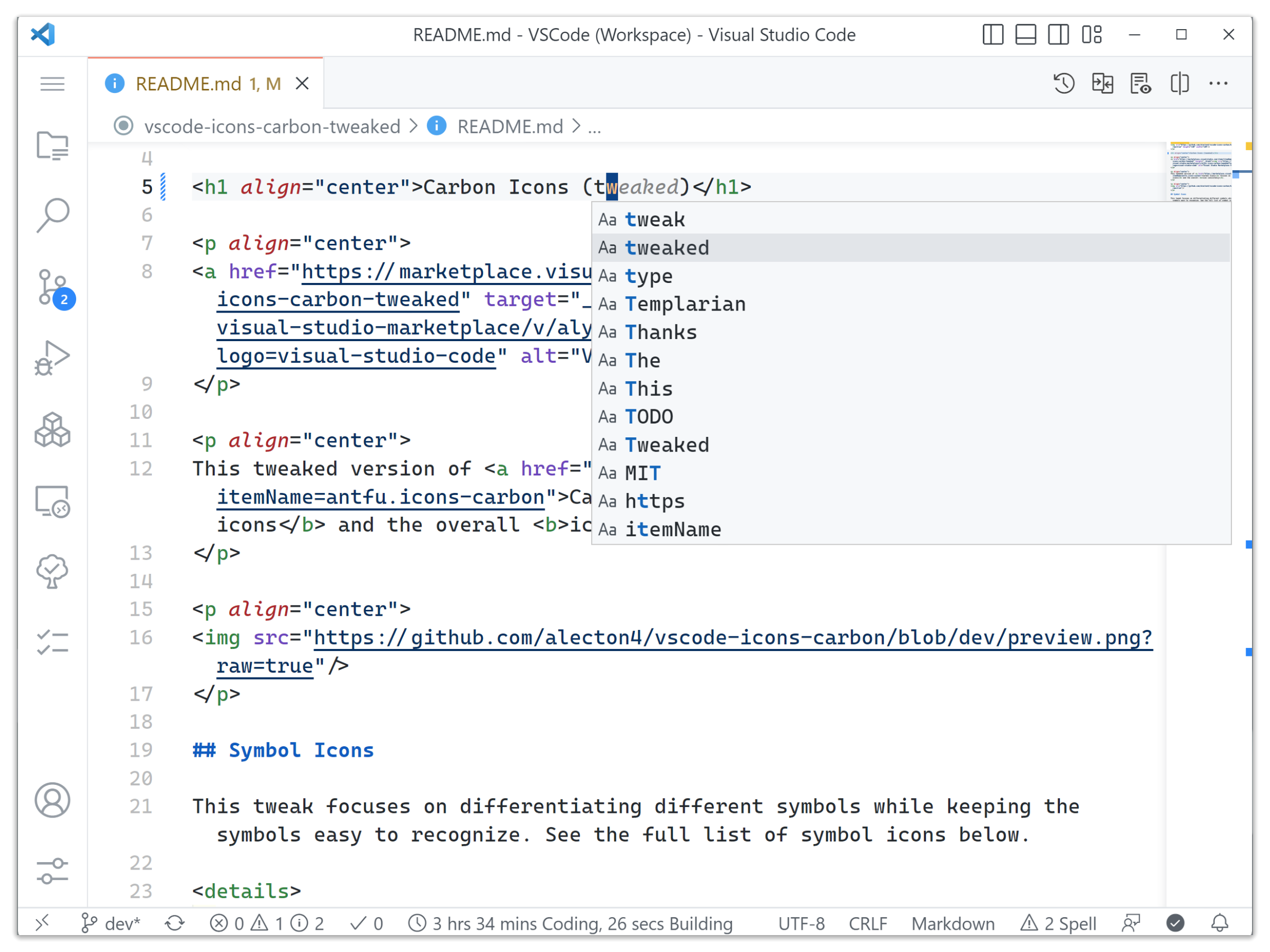
This tweaked version of Carbon Icons focuses on the symbol icons and the overall icon consistency.

This tweak focuses on differentiating different symbols while keeping the symbols easy to recognize. See the full list of symbol icons below.
Showcase of Symbol Icons (to be filled)
Symbol ID Default Carbon Tweaked symbol-array symbol-boolean symbol-class symbol-color symbol-constant symbol-constructor symbol-enum symbol-enum-member symbol-event symbol-field symbol-file symbol-folder symbol-function symbol-interface symbol-key symbol-keyword symbol-method symbol-misc symbol-module symbol-namespace symbol-null symbol-number symbol-numeric symbol-object symbol-operator symbol-package symbol-parameter symbol-property symbol-reference symbol-ruler symbol-snippet symbol-string symbol-struct symbol-structure symbol-text symbol-type-parameter symbol-unit symbol-value symbol-variable This tweak uses the original VSCode icons as much as possible. Altered icons are selected to have a similar style to the original ones.
Ported from Carbon Icons by @antfu. Thanks for the work and inspiration!
This extension styles css/web colors found in your document.
Feel free to contribute!
ErrorLens turbo-charges language diagnostic features by making diagnostics stand out more prominently, highlighting the entire line wherever a diagnostic is generated by the language and also prints the message inline.
- Highlight lines containing diagnostics
- Append diagnostic as text to the end of the line
- Show icons in gutter
- Show message in status bar
Command Description fd.errorLens.toggle Error Lens: Toggle (Enable/Disable) Everything (toggle global setting "fd.errorLens.enabled")fd.errorLens.toggleError Error Lens: Enable/Disable Errors in "fd.errorLens.enabledDiagnosticLevels"setting.fd.errorLens.toggleWarning Error Lens: Enable/Disable Warnings in "fd.errorLens.enabledDiagnosticLevels"setting.fd.errorLens.toggleInfo Error Lens: Enable/Disable Info in "fd.errorLens.enabledDiagnosticLevels"setting.fd.errorLens.toggleHint Error Lens: Enable/Disable Hint in "fd.errorLens.enabledDiagnosticLevels"setting.fd.errorLens.toggleInlineMessage Error Lens: Toggle global setting "fd.errorLens.messageEnabled".fd.errorLens.searchForProblem Error Lens: Open problem in default browser (controlled by fd.errorLens.searchForProblemQuerysetting).fd.errorLens.selectProblem Error Lens: Set editor selection to the problem range (controlled by fd.errorLens.selectProblemTypesetting).fd.errorlens.toggleWorkspace Error Lens: Exclude/Include current workspace by fs path. fd.errorLens.disableLine Error Lens: Add a comment to disable line for linter rule. Comment format is controlled by "fd.errorLens.disableLineComments"setting.fd.errorLens.findLinterRuleDefinition Error Lens: Search in local linter files (like .eslintrc.json) for the rule definition. Target files are controlled by "fd.errorLens.lintFilePaths" setting.fd.errorLens.copyProblemMessage Error Lens: Copy problem message to the clipboard (at the active cursor). fd.errorLens.copyProblemCode Error Lens: Copy problem code to the clipboard (at the active cursor). fd.errorLens.updateEverything Error Lens: Update all decorations. Supports args {"kind": "update" | "clear"} Flawuldragon - Error Lens extension settings start with
fd.errorLens.
Setting Default Description enabled true Controls all decorations and features (except commands). respectUpstreamEnabled {"enabled":true, "inlineMessage":true, "gutter":true, "statusBar":false} When enabled - extension will take into account global VSCode setting #problems.visibility#. (1.85.0 changelog).enabledInMergeConflict true Controls if decorations are shown if the editor has git merge conflict indicators <<<<<<<or=======or>>>>>>>.fontFamily "" Font family of inline message. fontWeight "normal" Font weight of inline message. "normal"is alias for 400,"bold"is alias for 700).fontStyleItalic false When enabled - shows inline message in italic font style. fontSize "" Font size of inline message (CSS units). margin "4ch" Distance between the last word on the line and the start of inline message (CSS units). alignMessage {"start":0, "end":0, "minimumMargin":0, "padding":[0, 0], "useFixedPosition":true} Align inline error message (either by starting position or ending position). Only works for monospace fonts. Set "start" and "end" to 0 to disable. padding "" Padding of the inline message. Visible when #errorLens.messageBackgroundMode#is set to "message".borderRadius "0.2em" Border radius of the inline message. Visible when #errorLens.messageBackgroundMode#is set to "message".enabledDiagnosticLevels ["error", "warning", "info"] Customize which diagnostic levels(severity) to highlight. messageTemplate "$message" Template used for all inline messages. Whitespace between items is important.
List of variables:
-$message- diagnostic message text
-$count- Number of diagnostics on the line
-$severity- Severity prefix taken from#errorLens.severityText#
-$source- Source of diagnostic e.g. "eslint"
-$code- Code of the diagnosticmessageMaxChars 500 Cut off inline message if it's longer than this value. (Improves performance when the diagnostic message is long). severityText ["⛔", "⚠", "ℹ", "🍏"] Replaces $severityvariable in#errorLens.messageTemplate#.messageEnabled true Controls whether inline message is shown or not (Including background highlight). messageBackgroundMode "line" Controls how inline message is highlighted in the editor (entire line / only message / none). problemRangeDecorationEnabled false When checked - highlight the entire problem range. editorHoverPartsEnabled {"messageEnabled":false, "sourceCodeEnabled":false, "buttonsEnabled":false} Controls which parts of the editor hover tooltip to show. statusBarIconsEnabled false When enabled - shows highlighted error/warning icons in status bar. statusBarIconsPriority -9000 Move status bar icons left or right by adjusting the number priority. statusBarIconsAlignment "left" Choose on which side the icons status bar is on: left or right. statusBarIconsTargetProblems "all" Which problems to use for counting problems at icons status bar. statusBarIconsUseBackground true When enabled - highlights status bar icons with background, when disabled - with foreground. statusBarIconsAtZero "removeBackground" What to do when there are 0 errors/warnings - hide the item or strip its background color. statusBarMessageEnabled false When enabled - shows message in status bar. statusBarMessagePriority -10000 Move status bar message left or right by adjusting the number priority. statusBarMessageAlignment "left" Choose on which side the message status bar is on: left or right. statusBarColorsEnabled false When enabled - use message decoration foreground as color of Status Bar text. Uses colors errorLens.statusBarErrorForeground,errorLens.statusBarWarningForeground,errorLens.statusBarInfoForeground,errorLens.statusBarHintForeground.statusBarMessageType "activeLine" Pick what to show in Status Bar: closest message or only message for the active line. statusBarCommand "goToProblem" Command that executes on click for Status Bar. statusBarMessageTemplate "" Template for status bar message. Whitespace between items is important.
List of variables:
-$message- diagnostic message text
-$count- Number of diagnostics on the line
-$severity- Severity prefix taken from#errorLens.severityText#
-$source- Source of diagnostic e.g. "eslint"
-$code- Code of the diagnosticreplace [] Specify message to transform. E.g. if this is configured to [{ matcher: 'foo (.*)', message: 'just $1' }], the message 'foo bar' would be displayed as 'just bar'. exclude [] Specify messages that should not be highlighted (RegExp). Strings passed to the RegExp constructor: new RegExp(EXCLUDE_ITEM, 'iu');excludeBySource [] Specify sourceorsource(code)pair to exclude. Examples:
-eslintdisable all ESLint problems
-eslint(padded-blocks)disablepadded-blocksrule of ESLint
-Pylancedisable all Pylance linter problems
-Pylance(reportUndefinedVariable)disablereportUndefinedVariablerule of PylanceexcludePatterns [] Exclude files by using glob pattern. Example ["**/*.{ts,js}"]excludeWorkspaces [] Exclude workspaces by path. disableLineComments {...} Used for errorLens.disableLinecommand that adds a comment disabling linter rule for a line.
To force comment on the same line - addSAME_LINEto the message:"eslint": "// eslint-disable-line $code SAME_LINE"lintFilePaths {...} Specify where to search for linter rule definitions by diagnostic source (glob for local linter files). node_modulesfolder is excluded.searchForProblemQuery "https://duckduckgo.com/?q=$message" Pick query to open in default browser when searching for problem with errorLens.searchForProblemcommand.selectProblemType "closestProblem" Which problem to select (closest / active line) when executing errorLens.selectProblemcommand.light Specify color of decorations for when the light color theme is active. delay 0 Delay (ms) before showing problem decorations (0 to disable). Minimum delay of 500 is enforced by the extension. #errorLens.delayMode#controls how to handle the delay.delayMode "new" Pick which version of the delay to use. onSave false When enabled - updates decorations only on document save (manual). onSaveTimeout 1000 Time period (ms) that used for showing decorations after the document save (manual, not auto save). onSaveUpdateOnActiveEditorChange true When #errorLens.onSave#enabled - extension still draws decorations when active/visible editors change.enableOnDiffView false Enable decorations when viewing a diff view in the editor (e.g. Git diff). followCursor "allLines" Highlight only portion of the problems. followCursorMore 0 Augments #errorLens.followCursor#.
Adds number of lines to top and bottom when#errorLens.followCursor#is set toactiveLine.
Adds number of closest problems when#errorLens.followCursor#isclosestProblemgutterIconsEnabled false When enabled - shows gutter icons (In place of the debug breakpoint icon). gutterIconsFollowCursorOverride true When enabled and #errorLens.followCursor#setting is notallLines, then gutter icons would be rendered for all problems. But line decorations (background, message) only for active line.gutterIconSize "100%" Change gutter icon size. Examples: auto,contain,cover,50%,150%(CSS units).gutterIconSet "default" Change gutter icon style. gutterEmoji {"error":"💀", "warning":"😞", "info":"🆗", "hint":"🍏"} Pick emoji symbol for gutter icon when #errorLens.gutterIconSet#isemoji.errorGutterIconPath "" Absolute path to error gutter icon. warningGutterIconPath "" Absolute path to warning gutter icon. infoGutterIconPath "" Absolute path to info gutter icon. hintGutterIconPath "" Absolute path to hint gutter icon. errorGutterIconColor "#e45454" Error color of simple gutter icons (shapes and letters). warningGutterIconColor "#ff942f" Warning color of simple gutter icons (shapes and letters). infoGutterIconColor "#00b7e4" Info color of simple gutter icons (shapes and letters). hintGutterIconColor "#2faf64" Hint color of simple gutter icons (shapes and letters). removeLinebreaks true When enabled - replaces line breaks in inline diagnostic message with whitespaces. replaceLinebreaksSymbol "⏎" Symbol to replace linebreaks. Requires enabling #errorLens.removeLinebreaks#.scrollbarHackEnabled false When enabled - prevents showing horizontal scrollbar in editor (caused by inline decorations). Also prevents mouse hover at inline message. ignoreUntitled false Controls whether to run on untitled (unsaved) files. ignoreDirty false Controls whether to run on dirty (modified unsaved) files. codeLensEnabled false Controls whether to show the Error Lens as a Code Lens above the code. codeLensLength {"min":0, "max":200} Enforce minimum and maximum length of code lens messages. codeLensTemplate "$severity $message" Template used for all messages appearing in the #errorLens.codeLensEnabled#. Whitespace between items is important.
List of variables:
-$message- diagnostic message text
-$count- Number of diagnostics on the line
-$severity- Severity prefix taken from#errorLens.severityText#
-$source- Source of diagnostic e.g. "eslint"
-$code- Code of the diagnosticcodeLensOnClick "showQuickFix" Controls what do on clicking the #errorLens.codeLensEnabled#.Can be specified in
settings.json(workbench.colorCustomizationssection)
Color Dark Light HC Description errorLens.errorBackground #e454541b#e4545420#e454541bBackground color of the entire line containing error. errorLens.errorMessageBackground #e4545419#e4545419#e4545419Background color of the error message. errorLens.errorRangeBackground #e4545419#e4545419#e4545419Background color of the error range (when errorLens.problemRangeDecorationEnabled setting enabled). errorLens.errorBackgroundLight #e4545420#e4545420#e4545420Background color of the entire line containing error (Only in light themes). errorLens.errorForeground #ff6464#e45454#ff6464Text color used to highlight lines containing errors. errorLens.errorForegroundLight #e45454#e45454#e45454Text color used to highlight lines containing errors (Only in light themes). errorLens.warningBackground #ff942f1b#ff942f20#ff942f1bBackground color used to highlight lines containing warnings. errorLens.warningMessageBackground #ff942f19#ff942f19#ff942f19Background color of the warning message. errorLens.warningRangeBackground #ff942f19#ff942f19#ff942f19Background color of the warning range (when errorLens.problemRangeDecorationEnabled setting enabled). errorLens.warningBackgroundLight #ff942f20#ff942f20#ff942f20Background color used to highlight lines containing warnings (Only in light themes). errorLens.warningForeground #fa973a#ff942f#fa973aText color used to highlight lines containing warnings. errorLens.warningForegroundLight #ff942f#ff942f#ff942fText color used to highlight lines containing warnings (Only in light themes). errorLens.infoBackground #00b7e420#00b7e420#00b7e420Background color used to highlight lines containing info. errorLens.infoMessageBackground #00b7e419#00b7e419#00b7e419Background color of the info message. errorLens.infoRangeBackground #00b7e419#00b7e419#00b7e419Background color of the info range (when errorLens.problemRangeDecorationEnabled setting enabled). errorLens.infoBackgroundLight #00b7e420#00b7e420#00b7e420Background color used to highlight lines containing info (Only in light themes). errorLens.infoForeground #00b7e4#00b7e4#00b7e4Text color used to highlight lines containing info. errorLens.infoForegroundLight #00b7e4#00b7e4#00b7e4Text color used to highlight lines containing info (Only in light themes). errorLens.hintBackground #17a2a220#17a2a220#17a2a220Background color used to highlight lines containing hints. errorLens.hintMessageBackground #17a2a219#17a2a219#17a2a219Background color of the hint message. errorLens.hintRangeBackground #17a2a219#17a2a219#17a2a219Background color of the hint range (when errorLens.problemRangeDecorationEnabled setting enabled). errorLens.hintBackgroundLight #17a2a220#17a2a220#17a2a220Background color used to highlight lines containing hints (Only in light themes). errorLens.hintForeground #2faf64#2faf64#2faf64Text color used to highlight lines containing hints. errorLens.hintForegroundLight #2faf64#2faf64#2faf64Text color used to highlight lines containing hints (Only in light themes). errorLens.statusBarIconErrorForeground #ff6464#e45454#ff6464Status bar icon item error color. Foreground is used when the errorLens.statusBarIconsUseBackgroundsetting is disabled.errorLens.statusBarIconWarningForeground #fa973a#ff942f#fa973aStatus bar icon item error color. Foreground is used when the errorLens.statusBarIconsUseBackgroundsetting is disabled.errorLens.statusBarErrorForeground #ff6464#e45454#ff6464Status bar item error color. errorLens.statusBarWarningForeground #fa973a#ff942f#fa973aStatus bar item warning color. errorLens.statusBarInfoForeground #00b7e4#00b7e4#00b7e4Status bar item info color. errorLens.statusBarHintForeground #2faf64#2faf64#2faf64Status bar item hint color. Line highlighting depends on the
"errorLens.messageBackgroundMode"setting.
#fff0- Completely transparent color.
Used only as inspiration for adjustments of the most complete version, it was not really incorporated into the project
Welcome to ErrorLens.
ErrorLens enhances Visual Studio Code's inbuilt diagnostic highlighting. Visual Studio Code's default behavior is to underline errors and warnings and other diagnostic messages using a 'squiggly underline'. Whilst this is certainly useful, the underline visual effect is subtle, and therefore can be easily overlooked in a busy file.
ErrorLens turbo-charges the language diagnostic features, by making diagnostics stand out more prominently, highlighting the entire line wherever a diagnostic is generated by the language and also prints the diagnostic message(s) in-line at the site of the line of code which is generating the diagnostic.
- Lines containing errors or warnings or info are highlighted more obviously.
- Diagnostic descriptions are appended to the end of any line containing diagnostic info, meaning that you do not have to context-switch to the problem view.
- The status bar shows the number of diagnostics for the open file. (This can be configured)
- Settings can be configured to control the way ErrorLens displays enhanced diagnostics.
- Works for any language which provides diagnostics.
This extension contributes the following settings:
errorLens.errorColor: The background color used to highlight lines containing errors. (Alpha component can be used)errorLens.errorTextColor: The text color used to highlight lines containing errors. (Alpha component can be used)errorLens.warningColor: The background color used to highlight lines containing warnings. (Alpha component can be used)errorLens.warningTextColor: The text color used to highlight lines containing warnings. (Alpha component can be used)errorLens.infoColor: The background color used to highlight lines containing info. (Alpha component can be used)errorLens.infoTextColor: The text color used to highlight lines containing info. (Alpha component can be used)errorLens.hintColor: The background color used to highlight lines containing hints. (Alpha component can be used)errorLens.hintTextColor: The text color used to highlight lines containing hints. (Alpha component can be used)errorLens.fontStyle: Show ErrorLens annotations in Italics, or not?errorLens.fontWeight: Specifies the font weight for ErrorLens annotations.errorLens.fontMargin: Distance between end of the code line, and the start of the ErrorLens annotation. (CSS units)errorLens.enabledDiagnosticLevels: Customize which diagnostic levels to highlight.errorLens.statusBarControl: Customize how the VS Code Status Bar shows errors and warnings.errorLens.addAnnotationTextPrefixes: If 'true', prefixes the diagnostic severity ('Error:', 'Warning:' etc) to ErrorLens annotations.This extension contributes the following commands:
ErrorLens.enable: Enable ErrorLens.ErrorLens.disable: Disable ErrorLens.
This vscode extension package show current file size in the right status bar without any configurations.
Enjoy!
A product icon theme for Visual Studio Code
HTML
idandclassattribute completion for Visual Studio Code.
- HTML
idandclassattribute completion- Supports completion from in file defined styles
- Supports specifying remote and local style sheets
- Supports any language for completion
- Supports go to definition for selectors
- Validates class attributes on demand
Supported languages can be configured with the
css.enabledLanguagesglobal setting. By defaulthtmlis enabled:{ "css.enabledLanguages": ["html"] }Extension can be configured to support any language where it makes sense such as
nunjucks,twig,mustache,vue,typescriptetc. You should also install corresponding language extension which registers the specific language id in VS Code.This setting is application scoped and changing the setting requires restarting VS Code.
Remote and local style sheets with optional glob patterns and variable substitutions can be specified in VS Code settings per workspace folder in
.vscode/settings.jsonand will suggest in all configured languages within that workspace folder.Glob patterns for local style sheets can have the following syntax:
Pattern Matches *zero or more characters in a path segment ?one character in a path segment **any number of path segments, including none {}group conditions like **/*.{css,scss}[]a range of characters like [0-9]or negate[!0-9]The following variable substitutions are supported for local style sheets as well:
Variable Substitution ${fileBasename}Current file's basename ${fileBasenameNoExtension}Current file's basename with no extension ${fileExtname}Current file's extension Configuration depends on your layout of the project. The following most basic setup will suggest from all
cssfiles in project'ssrcfolder:
.vscode/settings.json{ "css.styleSheets": ["src/**/*.css"] }If Bootstrap
npmmodule is used with additionalscssthe following can be a starting point:
.vscode/settings.json{ "css.styleSheets": [ "node_modules/bootstrap/dist/css/bootstrap.css", "src/**/*.scss" ] }or in case of Bootstrap CDN with additional plain
css:
.vscode/settings.json{ "css.styleSheets": [ "https://cdn.jsdelivr.net/npm/[email protected]/dist/css/bootstrap.min.css", "src/**/*.css" ] }All of Bootstrap's class selectors with additional user defined styles in the project will be available for completion in
htmlfiles.Enable
typescriptorjavascriptin global settings depending on your usage and restart VS Code:{ "css.enabledLanguages": ["html", "typescript"] }Component's static styles will be available for completion elsewhere in the component. If you need to use some base styles in every component you can specify as follows:
.vscode/settings.json{ "css.styleSheets": ["src/base-styles.ts"] }Variable substitution can be used to refer to a related
cssfile. If you are working onmy-component.tsand yourcssis inmy-component-css.tsthen a suitable setup can be:
.vscode/settings.json{ "css.styleSheets": ["**/${fileBasenameNoExtension}-css.ts"] }Install your favorite Vue language extension from Marketplace which registers
vuelanguage id then enablevuein global settings and restart VS Code:{ "css.enabledLanguages": ["html", "vue"] }Styles defined in component's
<style>section will be available for completion in component's<template>section.Variable substitution can be used for Angular development:
.vscode/settings.json{ "css.styleSheets": ["**/${fileBasenameNoExtension}.css"] }With this setup, styles defined in e.g.
app.component.csswill be available inapp.component.html.Go to definition for
idandclassselectors for local style sheets are supported. SelectingGo to Definitionfrom context menu (F12or⌘ click) on a selector will open the local style sheet which the selector is defined.Validates all
classselectors in the active editor. Auto validation can be configured in extension settings globally or per workspace.Clears style sheets cache.
A simple extension to make indentation more readable
This extension colorizes the indentation in front of your text, alternating four different colors on each step. Some may find it helpful in writing code for Python, Nim, Yaml, and probably even filetypes that are not indentation dependent.
Note: This will also work with vscode-web (github.dev) since version 8.0.0.
It uses the current editor window tab size and can handle mixed tab + spaces (not recommended). In addition, it visibly marks lines where the indentation is not a multiple of the tab size. The visualization can help to find problems with the indentation in some situations.
Although you can use it as it is, there is the possibility to configure some aspects of the extension:
  // For which languages indent-rainbow should be activated (if empty it means all).
  "fd.indentRainbow.includedLanguages": [] // for example ["nim", "nims", "python"]

  // For which languages indent-rainbow should be deactivated (if empty it means none).
  "fd.indentRainbow.excludedLanguages": ["plaintext"]

  // The delay in ms until the editor gets updated.
  "fd.indentRainbow.updateDelay": 100 // 10 makes it super fast but may cost more resources
Notice: Defining both
includedLanguagesandexcludedLanguagesdoes not make much sense. Use one of both!You can configure your own colors by adding and tampering with the following code:
  // Defining custom colors instead of default "Rainbow" for dark backgrounds.
  "fd.indentRainbow.colors": [
    "rgba(255,255,64,0.07)",
    "rgba(127,255,127,0.07)",
    "rgba(255,127,255,0.07)",
    "rgba(79,236,236,0.07)"
  ]

 // The indent color if the number of spaces is not a multiple of "tabSize".
 "fd.indentRainbow.errorColor": "rgba(128,32,32,0.6)"

 // The indent color when there is a mix between spaces and tabs.
 // To be disabled this coloring set this to an empty string.
 "fd.indentRainbow.tabmixColor": "rgba(128,32,96,0.6)"
Notice:
errorColorwas renamed fromerror_colorin earlier versions.There is a (new) alternate mode that uses lines (with a customizable width) instead of the background coloring of the whitespace. Here is an example configuration I like:
  // Using the light mode
  "fd.indentRainbow.indicatorStyle": "light",
  // we use a simple 1 pixel wide line
  "fd.indentRainbow.lightIndicatorStyleLineWidth": 1,
  // the same colors as above but more visible
  "fd.indentRainbow.colors": [
    "rgba(255,255,64,0.3)",
    "rgba(127,255,127,0.3)",
    "rgba(255,127,255,0.3)",
    "rgba(79,236,236,0.3)"
  ]
For this addition, a big thank you goes to Christian Hoock wk1. He also added the editor window reload on config changes.
Skip error highlighting for RegEx patterns. For example, you may want to turn off the indent errors for JSDoc's valid additional space (disabled by default), or comment lines beginning with
//// Example of regular expression in JSON (note double backslash to escape characters) "fd.indentRainbow.ignoreLinePatterns" : [ "/[ \t]* [*]/g", // lines begining with <whitespace><space>* "/[ \t]+[/]{2}/g" // lines begininning with <whitespace>// ]Skip error highlighting for some or all languages. For example, you may want to turn off the indent errors for
markdownandhaskell(which is the default)"fd.indentRainbow.ignoreErrorLanguages" : [ "markdown", "haskell" ]If error color is disabled, indent colors will be rendered until the length of rendered characters (white spaces, tabs, and other ones) is divisible by tabsize. Turn on this option to render white spaces and tabs only.
"fd.indentRainbow.colorOnWhiteSpaceOnly": true // false is the default
Icon theme extension for Visual Studio Code that uses JetBrains IntelliJ product icons.
coming with Light, Dark and Auto variants
Jetbrains icons: https://jetbrains.design/intellij/resources/icons_list/
vscode product icon theme document: https://code.visualstudio.com/api/extension-guides/product-icon-theme
vscode icon reference: https://code.visualstudio.com/api/references/icons-in-labels#icon-listing

When the Font Directory appears, install fonts if you haven't already, and restart VSCODE once you have.
Note: this is because of
OSlimitations, the fonts must be installed manually.
Activate JetBrains Mono Font packDeactivate JetBrains Mono FontThere are 8 font styles available in JetBrains Mono, from Thin to ExtraBold, each coming with its own italic version.
While characters remain standard in width, the height of the lowercase is maximized. This approach keeps code lines to the length that developers expect, and it helps improve rendering in small size, since each symbol occupies more pixels.
A ligature is a character consisting of two or more joined symbols. Traditionally, it was introduced as a space-saving technique in printed texts. In code, this technique is adopted to show operators and is used mainly for two purposes:
- To reduce noise by merging symbols and removing details so the eyes are processing less:
- To balance whitespace more efficiently by shifting the glyphs in certain cases:
You can find full JetBrains Mono character set on official wiki page.
Check out - FiraCode Font Pack

🎨 🖌️ Product Icon Theme featuring Material Icons for VS Code.
This extension replaces the VS Code default icons with the Material Design icons:
The product icons can be activated via command palette:
or user settings:
"workbench.productIconTheme": "materialiconic-product-icons"

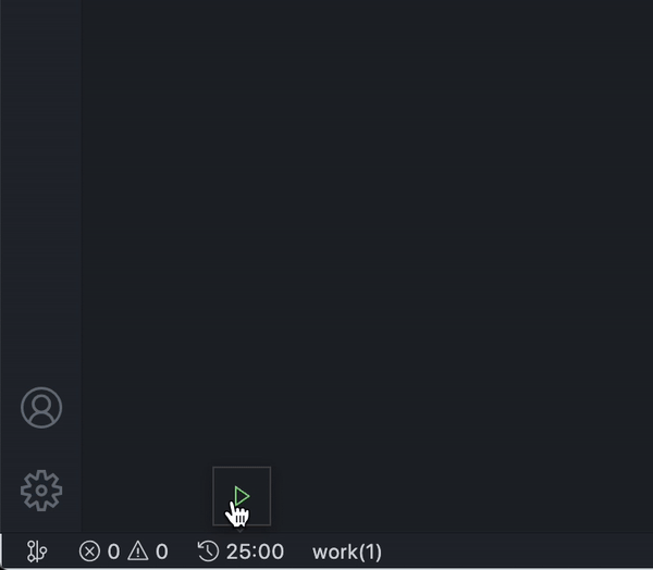
Pomodoro clock for VS Code -- The time management for a more productive way to work on VS Code with Pomodoro technique.
- Follow Pomodoro technique.
- After each pomodoro, we have a short break. We have long break in 1 times each 4 (can be customized) short break times.
- Extension show a count down(can be customized) clock and name of process.
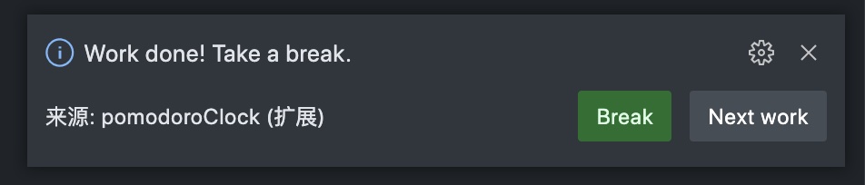
- When the time is up, there will be a notification prompt and a shortcut action button.
- Ability to Start timer、Pause timer、Restart Timer、 Reset timer on statu bar.
- Provides a simple statistical function that can count the number of Pomodoro clocks today
Tip: You can click the clock to toggle
countdowndisplay. You can also use it as a simple timer when thepomodoroClock.countdownisfalseInstall Pomodoro Clock via VS Code market
A simple Pomodoro clock shows in the status bar here.
Pomodoro clock and Pomodoro type info
Notification when time up
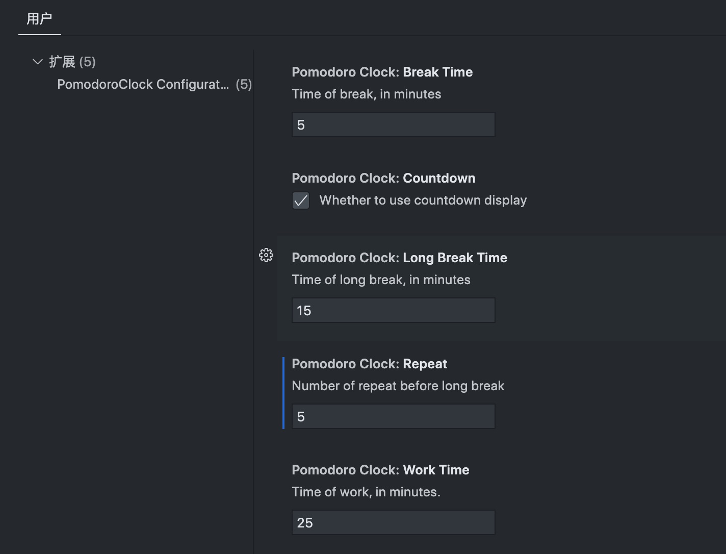
Pomodoro clock Extension Settings
This extension contributes the following settings:
fd.pomodoroClock.workTime: Work time (in minutes, default is 25).fd.pomodoroClock.breakTime: Short break time (in minutes, default is 5).fd.pomodoroClock.longBreakTime: Long break time (in minutes, default is 15).fd.pomodoroClock.repeat: Number of repeat before long break(default is 4).fd.pomodoroClock.countdown: Whether to use countdown display(default is true).Tip: Reload window to apply the settings. (except
pomodoroClock.countdown, it will take effect immediately)
yarn installnpm run watchornpm run compileF5to start debugging
Inspired by the Pomodoro-code
some icons come from vscode-codicons
Pick your favorite theme and have fun! 🎉
You can choose which icons to use from the Library:
Image source: neirelo.com
A simple VS Code extension that helps protect your eyes by reminding you to take a break every 20 minutes (Inspired by the 20-20-20 rule).
The 20-20-20 rule advises taking a 20-second break every 20 minutes and looking at something 20 feet away. It helps reduce eye strain from prolonged screen use.
Take a break: Stop: Stops showing the reminders.
Take a break: Start: Restarts showing the reminders.
Note: After installing the extension, reminders will be started automatically and then you can stop and start them using the previous commands.

Flawuldragon Note: The 20/20/20 rule of takeabreak integration can have the time custom in Flawuldragon, giving an additional option of configuration to users.

This extension is based on [Day Night Theme Switcher] by freetonik
- Support for the Official VS Code theme preferences
- Easily switch to/between your preferred light/dark themes
- Option to set the statusbar item priority
Theme Switchprovides a simple way to switch between your preferred light and dark theme with a single click.A package by [Fooxly]. Based on [Day Night Theme Switcher] by freetonik.
- Switch between your preferred light/dark themes
- Easily set a new theme as your default light/dark theme

workbench.preferredLightColorTheme: Your preferred light theme ("Default Light+"by default)"workbench.preferredLightColorTheme": <string>
workbench.preferredDarkColorTheme: Your preferred dark theme ("Default Dark+"by default)"workbench.preferredDarkColorTheme": <string>
window.autoDetectColorScheme: Instructs VS Code to listen to changes to the OS's color scheme and switch to a matching theme accordingly (falseby default)"window.autoDetectColorScheme": <true|false>
fd.themeswitch.toggleDefaultDark: If your preferred light/dark theme is not the current theme and the toggle is triggered, switch to your dark theme (trueby default)"fd.themeswitch.toggleDefaultDark": <true|false>
fd.themeswitch.priority: The priority for the statusbar toggle (0by default)"fd.themeswitch.priority": <number>

Highlight
TODO,FIXMEand other annotations within your code.Sometimes you forget to review the TODOs you've added while coding before you publish the code to production. So I've been wanting an extension for a long time that highlights them and reminds me that there are notes or things not done yet.
Hope this extension helps you as well.
NOTICE
Many report that the
List highlighted annotationscommand is not working, make sure you have the file types included viatodohighlight.include.
with
material nightcolor theme:with
material night eightiescolor theme:
TODO:,FIXME:are built-in keywords. You can override the look by customizing the setting.To customize the keywords and other stuff, command + , (Windows / Linux: File -> Preferences -> User Settings) open the vscode file
settings.json.
type default description fd.todohighlight.isEnable boolean true Toggle the highlight, default is true. fd.todohighlight.isCaseSensitive boolean true Whether the keywords are case sensitive or not. fd.todohighlight.keywords array N/A An array of keywords that will be hilighted. You can also specify the style for each keywords here. See example below for more infomation. fd.todohighlight.keywordsPattern string N/A Specify keywords via RegExp instead of todohighlight.keywordsone by one. NOTE that if this presents,todohighlight.keywordswill be ignored. And REMEMBER to escapse the back slash if there's any in your regexp (using \ instead of signle back slash).fd.todohighlight.defaultStyle object N/A Specify the default style for custom keywords, if not specified, build in default style will be applied. See all available properties on VSCode doc DecorationRenderOptions section fd.todohighlight.include array [ "**/*.js","**/*.jsx","**/*.ts","**/*.tsx","**/*.html","**/*.php","**/*.css","**/*.scss"
]Glob patterns that defines the files to search for. Only include files you need, DO NOT USE {**/*.*}for both permormance and avoiding binary files reason.
For backwards compatability, a string combine all the patterns is also valid"{**/*.js,**/*.jsx,**/*.ts,**/*.tsx,**/*.html,**/*.php,**/*.css,**/*.scss}"fd.todohighlight.exclude array [ "**/node_modules/**","**/dist/**","**/bower_components/**","**/build/**","**/.vscode/**","**/.github/**","**/_output/**","**/*.min.*","**/*.map"
]Glob pattern that defines files and folders to exclude while listing annotations.
For backwards compatability, a string combine all the patterns is also valid"{**/node_modules/**,**/bower_components/**,**/dist/**,**/build/**,**/.vscode/**,**/_output/**,**/*.min.*,**/*.map}"fd.todohighlight.maxFilesForSearch number 5120 Max files for searching, mostly you don't need to configure this. fd.todohighlight.toggleURI boolean false If the file path within the output channel not clickable, set this to true to toggle the path patten between <path>#<line>and<path>:<line>:<column>.an example of customizing configuration:
{ "fd.todohighlight.isEnable": true, "fd.todohighlight.isCaseSensitive": true, "fd.todohighlight.keywords": [ "DEBUG:", "REVIEW:", { "text": "NOTE:", "color": "#ff0000", "backgroundColor": "yellow", "overviewRulerColor": "grey" }, { "text": "HACK:", "color": "#000", "isWholeLine": false, }, { "text": "TODO:", "color": "red", "border": "1px solid red", "borderRadius": "2px", //NOTE: using borderRadius along with `border` or you will see nothing change "backgroundColor": "rgba(0,0,0,.2)", //other styling properties goes here ... } ], "fd.todohighlight.keywordsPattern": "TODO:|FIXME:|\\(([^)]+)\\)", //highlight `TODO:`,`FIXME:` or content between parentheses "fd.todohighlight.defaultStyle": { "color": "red", "backgroundColor": "#ffab00", "overviewRulerColor": "#ffab00", "cursor": "pointer", "border": "1px solid #eee", "borderRadius": "2px", "isWholeLine": true, //other styling properties goes here ... }, "fd.todohighlight.include": [ "**/*.js", "**/*.jsx", "**/*.ts", "**/*.tsx", "**/*.html", "**/*.php", "**/*.css", "**/*.scss" ], "fd.todohighlight.exclude": [ "**/node_modules/**", "**/bower_components/**", "**/dist/**", "**/build/**", "**/.vscode/**", "**/.github/**", "**/_output/**", "**/*.min.*", "**/*.map", "**/.next/**" ], "fd.todohighlight.maxFilesForSearch": 5120, "fd.todohighlight.toggleURI": false }This extension contributes the following commands to the Command palette.
Toggle highlight: turn on/off the highlightList highlighted annotations: list annotations and reveal from corresponding file


- VSCode doesn't have a direct command to Toggle the Bracket Pair Guides. This extension adds a command and keyboard binding that will toggle the setting.
- Toggle the Bracket Guides with
CTRL+SHIFT+B. (Mac users CMD+SHIFT+B).- There are 3 states for the setting:
- Active: will show the guides for the current active bracket pair
- True: will show the guides for all bracket pair and highlight the current active pair
- False: guides disabled
editor.guides.bracketpairs: Active/True/False.
Using modified icons from Visual Studio Image Library, adapted to match VS2022. The icons are compiled to dark, light, and high contrast themes.
Featuring official icons from the Visual Studio Image Library. These icons have been color optimized to work well for dark, light, and high contrast themes. I've tried to match Visual Studio's choice of icons as much as possible, and using other library icons for some files that would otherwise use the default file icon. I welcome any feedback or suggestions.
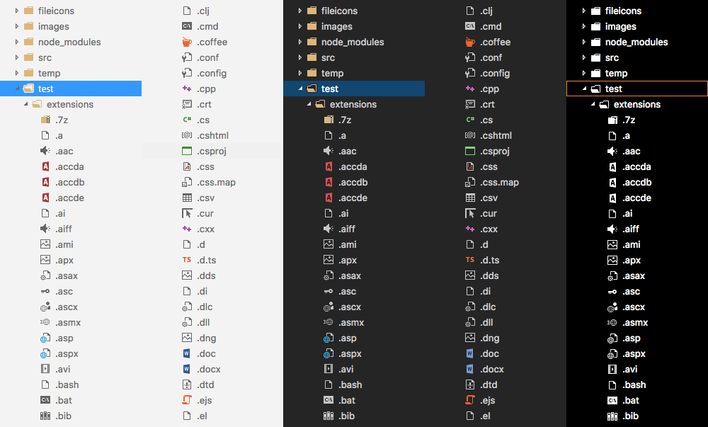
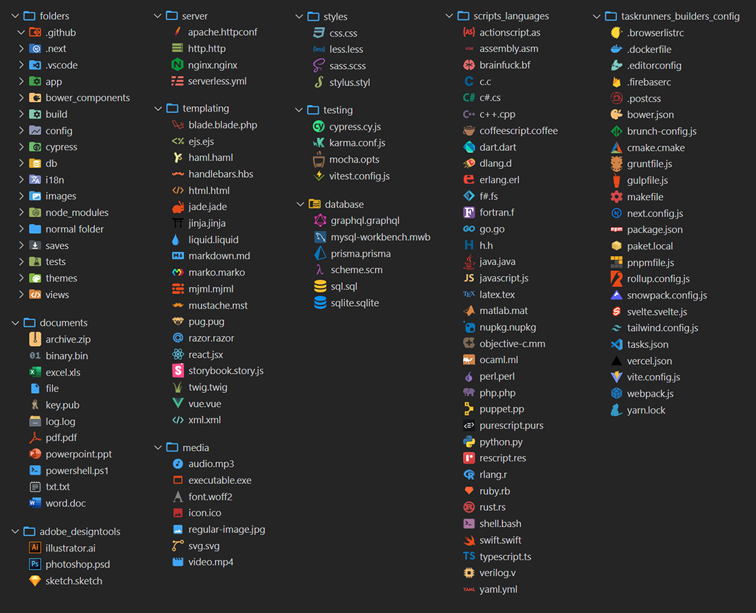
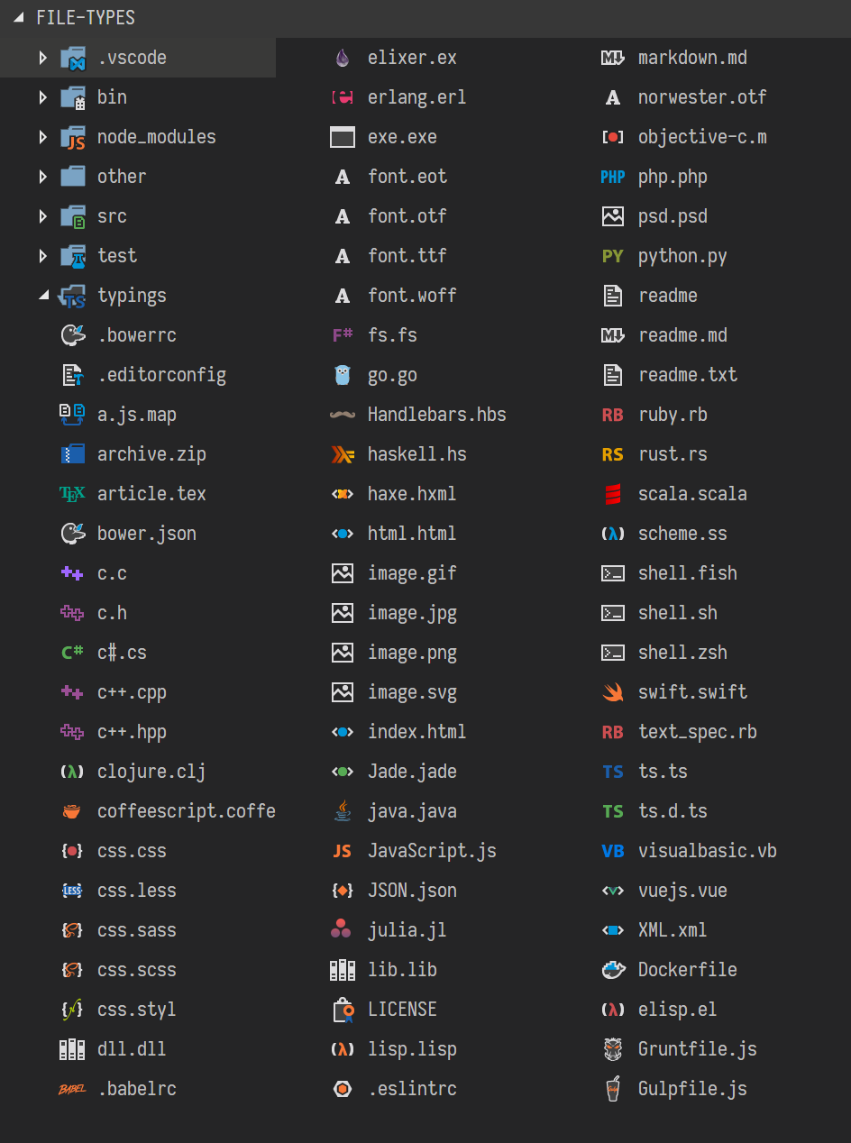
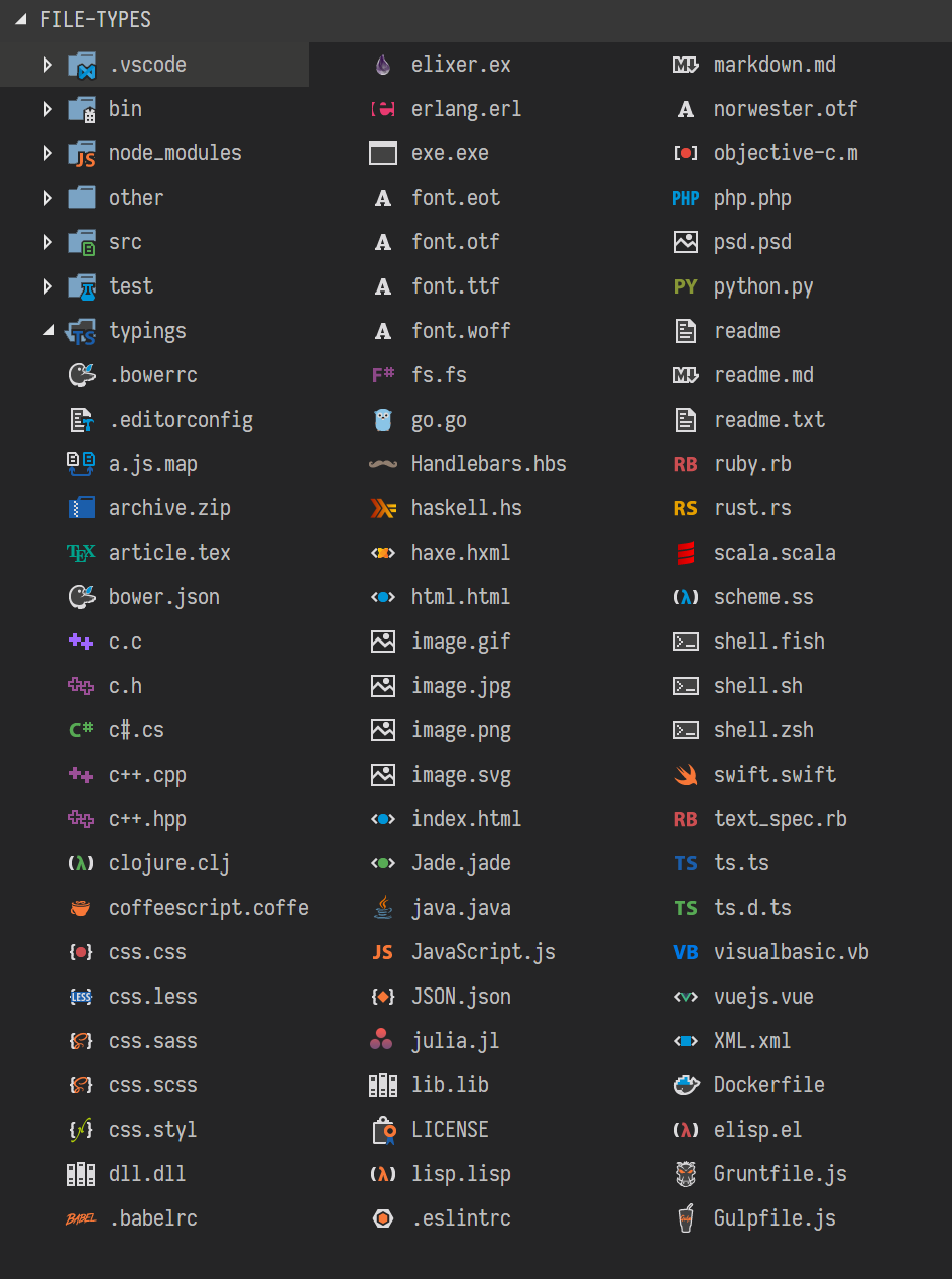
A big pack of icons (200+) for your files.
And many more! This preview is not exhaustive!
Enjoy ☺
Wow, we passed the 1 million installations! I’m proud that ya’ll appreciate my little set. I keep receiving very kind reviews from users. Thank you very much!
After installation and activation, you should go in settings (
File→Preferences→File Icon Themeon Windows, orCode→Preferences→File Icon Themeon macOS), and selectVSCode Great Icons.I can add more icons if you need, open a new issue to ask which extension you want.
Once installed and after reloading
vscode, you will be presented with a message toActivatethe icons.In case this doesn't happen, navigate to:
Linux&Windows=>File > Preferences > Theme > File Icon Theme > VSCode Icons.MacOS=>Code > Preferences > File Icon Theme > VSCode Icons.
vscode-iconsis being shipped with a lot of features, like:Choose the icon you prefer for any particular file extension.
You don't see the icon you like...? No worries, we got you covered. This link will show you how you can use your own custom icon!
Are you using Angular? This feature will detect it and enable the icons for you. It also works with other frameworks.
In our wiki you can find more information about the extension features and more.
Some examples:
vscode-iconsuses Crowdin to provide translations forvscodesupported languages.We are looking for translators and proofreaders for all
vscodesupported languages.If you'd like to contribute, checkout the translation section.
Kudos to all contributors that made this extension what it is.
We like to express our "Special Thanks" to:
- All users that made us their favorite Icons theme. We wouldn't be where we are without you.
- vscode-icons for GitHub by @dderevjanik will allow you to see all
GitHub's files withvscode-iconsicons.- vscode-icons-js by @dderevjanik get file/folder specific icon from
vscode-iconsicons.Enjoy!
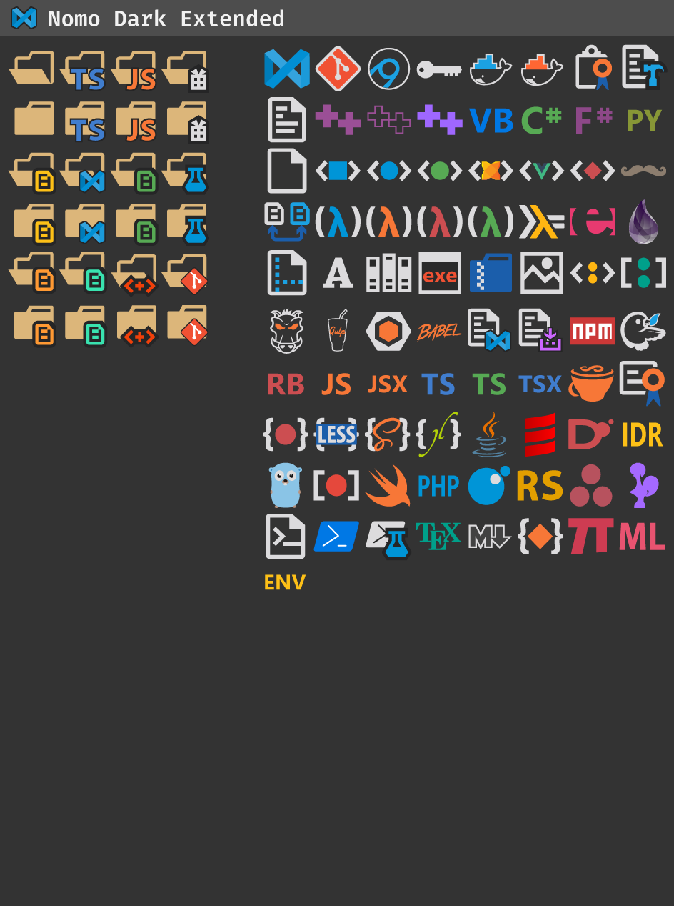
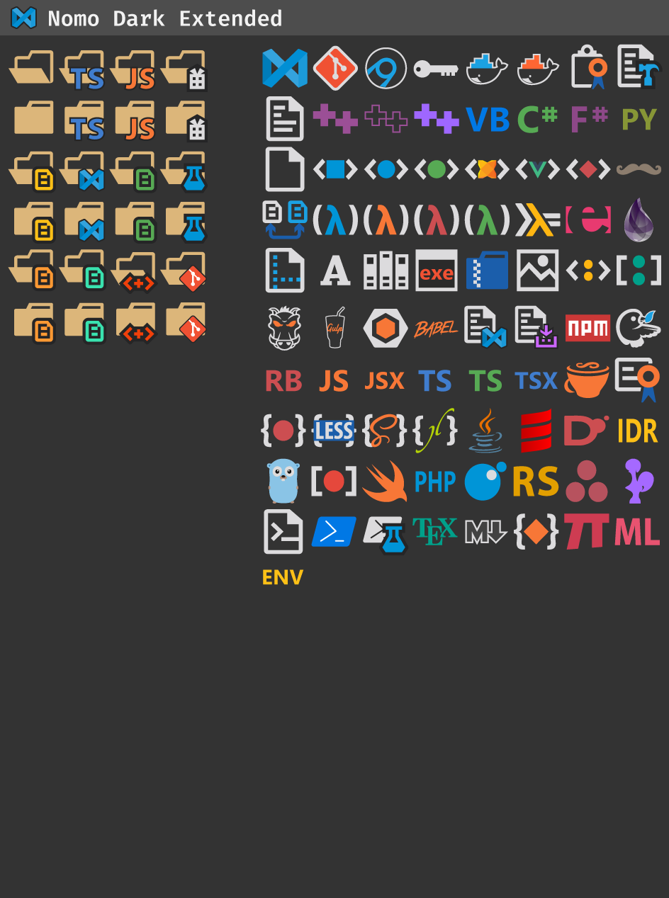
Visual Studio Code Nomo Dark Icons by Renzhi Li, Visual Studio Code Nomo Dark Icons (MacOS) by Gaulomatic and Visual Studio Code Nomo Light Icons by microhobby
Forked from be5invis/vscode-iconset
You can configure which folders and files icons are displayed by using the following settings:
"symbols.folders.associations": {
    "{folder name}": "{icon name}"
}
And here is an example using this setting:
"symbols.folders.associations": { "entities": "folder-assets", "infra": "folder-app", "schemas": "folder-purple" }"symbols.files.associations": { "{file name}": "{icon name}" }And here is an example:
"symbols.files.associations": {
   "app.module.ts": "nest",
   "*.service.ts": "nest"
}
Note: For file names, you can use
*to match all files with a specific file extension.You can preview the icons by reading the the preview.md file.
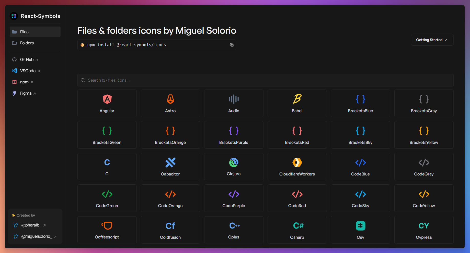
Pablo Hdez has graciously created React-Symbols (pheralb/react-symbols) to allow you to embed Symbol icons for your React projects.


This Visual Studio Code icons theme takes its inspiration from classic versions of Visual Studio prior to 2012. Icons for files tend to be colourful and distinctive. Where possible, the direct Visual Studio icon is used for a file type, but occasionally they need to be modified or created for newer file types that were not given a special icon by Visual Studio versions prior to 2012.
For better adaptability, there are two project versions, Universal for Desktop and the web with some disabled features for better browser operation.
| Universal Version | Web Version | |
|---|---|---|
| Flawuldragon Vanilla | Yes | Yes |
| Auto Close Tag | Yes | Yes |
| Auto Complete Tag | Yes | Yes |
| Auto Rename Tag | Yes | Yes |
| Color Highlight | Yes | Yes |
| Error Lens | Yes | Yes |
| Filesize | Yes | Yes |
| HTML CSS Support | Yes | Yes |
| Indent Rainbow | Yes | Yes |
| Jetbrains Mono Font | Yes | No |
| Jetbrains Icons | Yes | Yes |
| Jetbrains IDEA Product Icons | Yes | Yes |
| Material Iconic Product Icons | Yes | Yes |
| Pomodoro Clock | Yes | Yes |
| Sakai Icons | Yes | Yes |
| Take a Break | Yes | Yes |
| Theme Switch | Yes | Yes |
| Todo Highlight | Yes | Yes |
| Toggle Bracket Guides | Yes | Yes |
| Visual Studio 2022 Icons | Yes | Yes |
| Visual Studio Icons | Yes | Yes |
| Visual Studio Code Great Icons | Yes | Yes |
| Visual Studio Code Icons | Yes | Yes |
| Visual Studio Code Nomo Dark Icons | Yes | Yes |
| Visual Studio Code Nomo Light Icons | Yes | Yes |
| Visual Studio Code Symbols Icons | Yes | Yes |
| Visual Studio Classic Icons | Yes | Yes |
The Humbanew project documentation project will soon be available in multiple languages, as well as the English used by developers around the world.
All license terms and use notifications are available in the LICENSE.md file at the root of the project.
Page of LICENSE.md
Humbanew Support Mail Humbanew Flawuldragon Discussions Humbanew Flawuldragon Pull Requests
To contribute to the project, follow the steps below:
- Fork the project
- Create a new branch (
git checkout -b feature-[feature-name]) - Commit the changes (
git commit -am 'Add new feature - description of added feature') - Push the changes (
git push origin feature-[feature-name]) - Create a new Pull Request
At some point in the future will be available to patrons.
This project was built using object-oriented architecture, both with home-made features and third party projects that adopt open source and MIT standard.If any error occurs during the extension execution, only that module will be deactivated without affecting the operation of the others and the extension (root). Check out a simplified illustrative example of the final architecture.
Enjoy! 🙂👌