Target use cases
The FlexboxLayout is not a replacement for the existing layouts, however it achieves some designs more easily than other Layouts. In particular, the FlexboxLayout gives the designer the ability to freely shrink the Viewchildren to prevent overflow or grow them to fill available space. In addition, the FlexboxLayout supports controlling both the main-axis and the cross-axis, allowing the designer great flexibility for mobile app layouts.
For example, writing a grid using LinearLayout would require a Viewgroup to act as a container, a Viewgroup to act as a grid row, and finally a View for each individual grid element. With FlexboxLayout you can create a grid by controlling both where lines wrap and the size of individual grid elements regardless of screen width or height.
The FlexboxLayout allows you to easily place elements of differing size in a grid without overflowng the parent. Unlike the the example in the Material Design Guidelines this can be done in a single Layout.
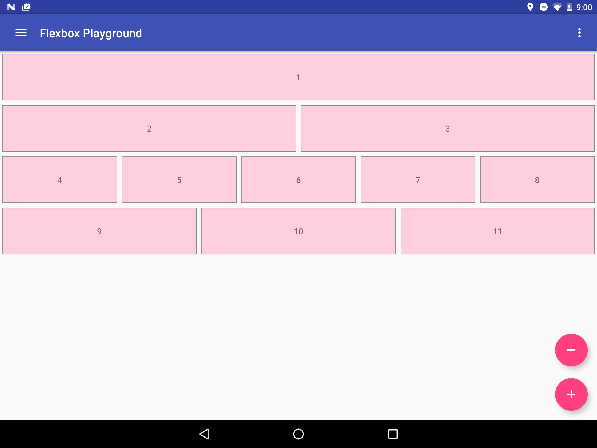
Given several TextViews of differing size, the FlexboxLayout will maintain a constant ratio between TextViews regardless of changing size based on defined attributes, as seen below.
Originally the screen fills the whole window.
But as the screen shrinks the TextViews shrink as well.
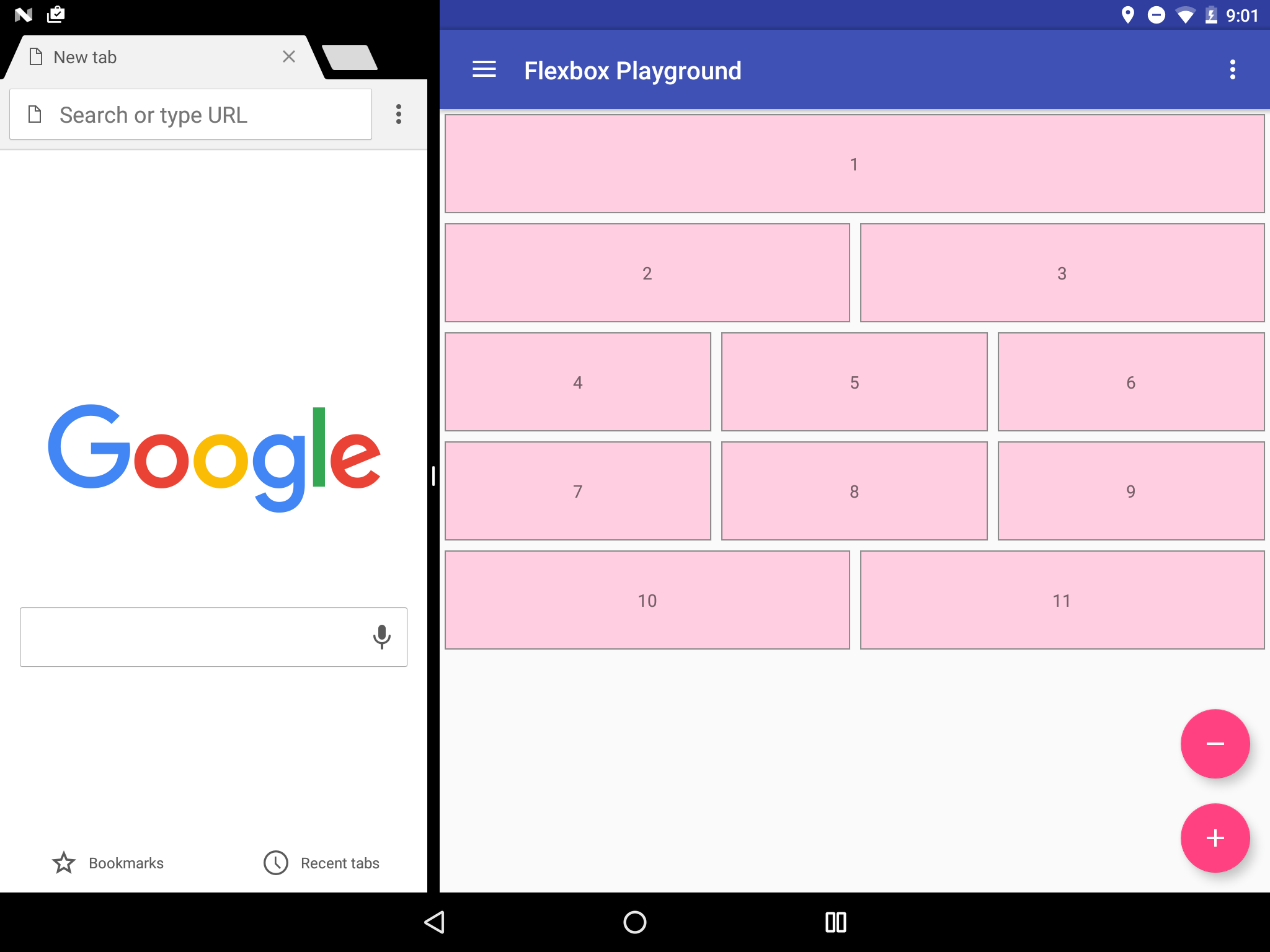
Note that there are always one TextView on the first row and two TextViews on row two...
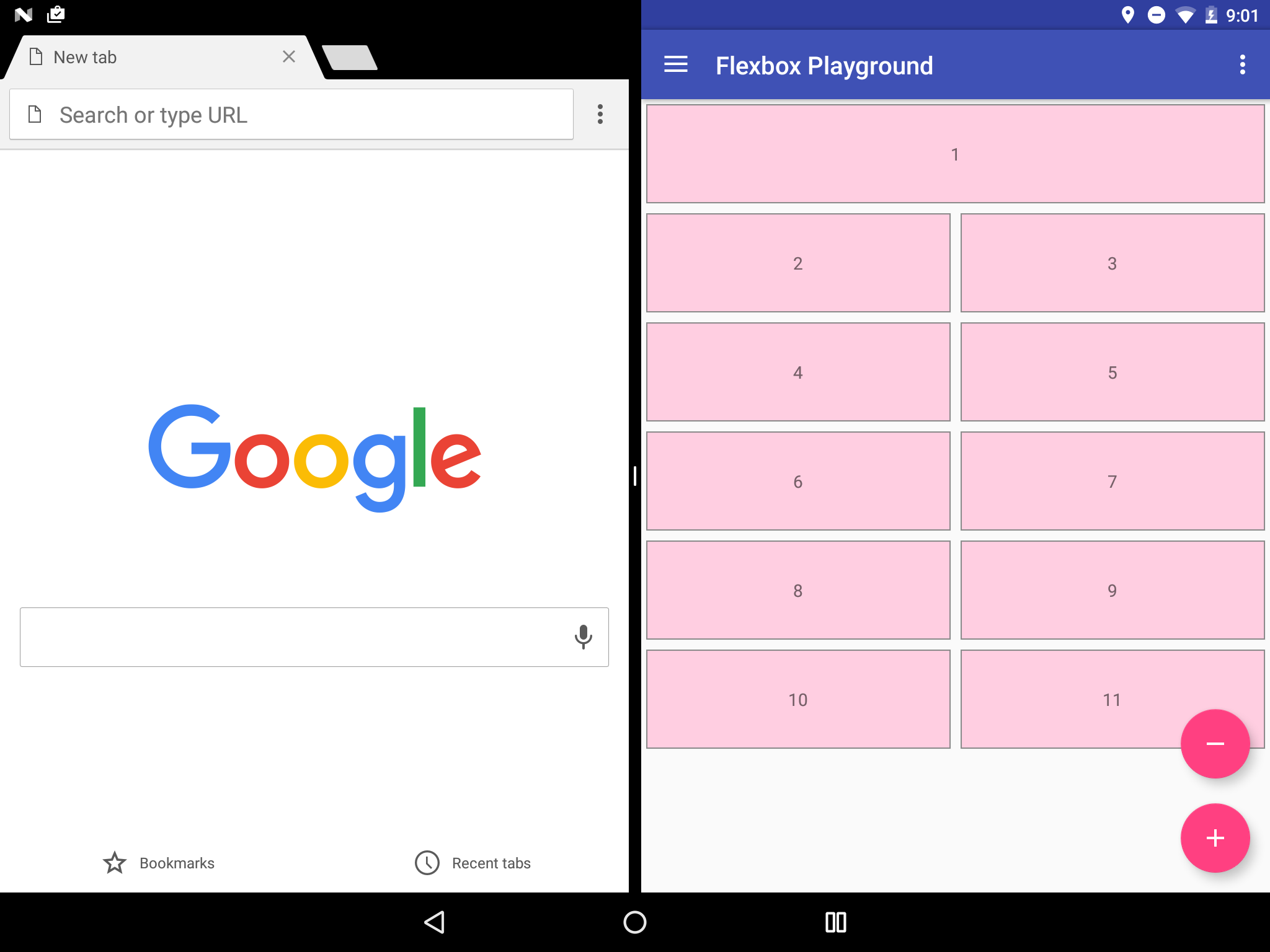
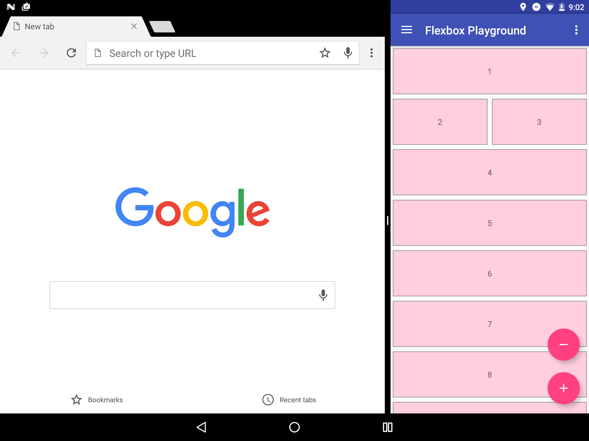
...but the rest of the rows change the number of elements they have dynamically.
The layout file for the grid above looks like:
<com.google.android.flexbox.FlexboxLayout
    xmlns:android="http://schemas.android.com/apk/res/android"
    xmlns:app="http://schemas.android.com/apk/res-auto"
    android:layout_width="match_parent"
    android:layout_height="match_parent"
    app:flexWrap="wrap"
    app:alignItems="flex_start"
    app:alignContent="flex_start" >

    <TextView
        android:layout_width="800dp"
        android:layout_height="80dp"
        android:text="1"
        style="@style/FlexItem"
        app:layout_flexGrow="1" />

    <TextView
        android:layout_width="180dp"
        android:layout_height="80dp"
        android:text="2"
        style="@style/FlexItem"
        app:layout_flexGrow="1"
        app:layout_flexBasisPercent="45%" />

    <TextView
        android:layout_width="180dp"
        android:layout_height="80dp"
        android:text="3"
        style="@style/FlexItem"
        app:layout_flexGrow="1"
        app:layout_flexBasisPercent="45%" />

    <TextView
        android:layout_width="180dp"
        android:layout_height="80dp"
        android:text="4"
        style="@style/FlexItem"
        app:layout_flexGrow="1" />

    <TextView
        android:layout_width="180dp"
        android:layout_height="80dp"
        android:text="5"
        style="@style/FlexItem"
        app:layout_flexGrow="1" />

    <TextView
        android:layout_width="180dp"
        android:layout_height="80dp"
        android:text="6"
        style="@style/FlexItem"
        app:layout_flexGrow="1" />

    <TextView
        android:layout_width="180dp"
        android:layout_height="80dp"
        android:text="7"
        style="@style/FlexItem"
        app:layout_flexGrow="1" />

    <TextView
        android:layout_width="180dp"
        android:layout_height="80dp"
        android:text="8"
        style="@style/FlexItem"
        app:layout_flexGrow="1" />

    <TextView
        android:layout_width="180dp"
        android:layout_height="80dp"
        android:text="9"
        style="@style/FlexItem"
        app:layout_flexGrow="1" />

    <TextView
        android:layout_width="180dp"
        android:layout_height="80dp"
        android:text="10"
        style="@style/FlexItem"
        app:layout_flexGrow="1" />

    <TextView
        android:layout_width="180dp"
        android:layout_height="80dp"
        android:text="11"
        style="@style/FlexItem"
        app:layout_flexGrow="1" />
</com.google.android.flexbox.FlexboxLayout>The flexDirection attribute is not set, so it defaults torow. The flexWrap attribute is set as wrap.
Thus, the direction of the main axis is determined to be from left to right (in LTR languages) and the flex container is multi-line. The FlexboxLayout collects each TextView one by one until the next collected item would not fit into the FlexboxLayout's width.
The initial length of each flex item (TextView) along the main axis is set to layout_width. The second and third TextView lengths are calculated using the layout_flexBasisPercent attributes.
After all TextViews are collected, FlexboxLayout checks the layout_flexGrow attribute, which is set to 1 for all TextViews - which means each item tries to expand in a 1:1 ratio if enough positive free space is given for each flex line.
Note: Flex Lines are theoretical row holding containers in a FlexboxLayout.
The example above uses split screens to test the FlexboxLayout under various screen widths, but exactly the same behavior applies to the situation where the app runs on various devices (including phones, tablets) and orientations (portlait, landscape).
Note: Putting hundreds of items in the FlexboxLayout and make it scrollable (wrapped with a ScrollView) is not recommended, because the FlexboxLayout is implemented as a subclass of the ViewGroup. Thus view recycling is not considered and a new class as a subclass of the RecyclerView.LayoutManager is more efficient as in the issue #2