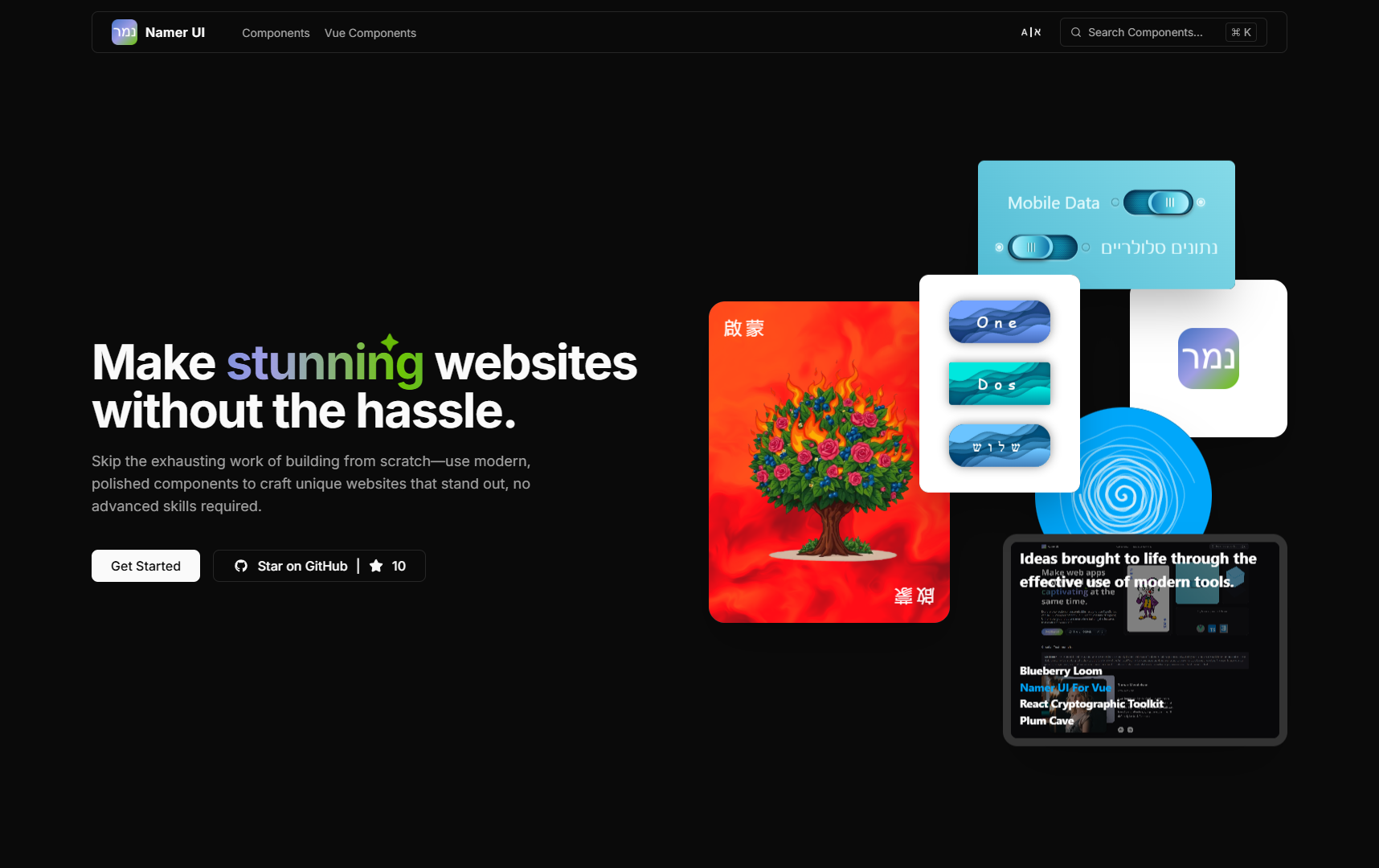
Namer UI is a collection of reusable Next.js/React components made to empower developers to quickly build beautiful UIs.
Spend less time designing UI from the ground up and more time building the features that matter to your users.
Check it out at https://namer-ui.vercel.app
The outdated version is hosted at: https://namer-ui.netlify.app/
SourceForge page: https://sourceforge.net/projects/namer-ui/
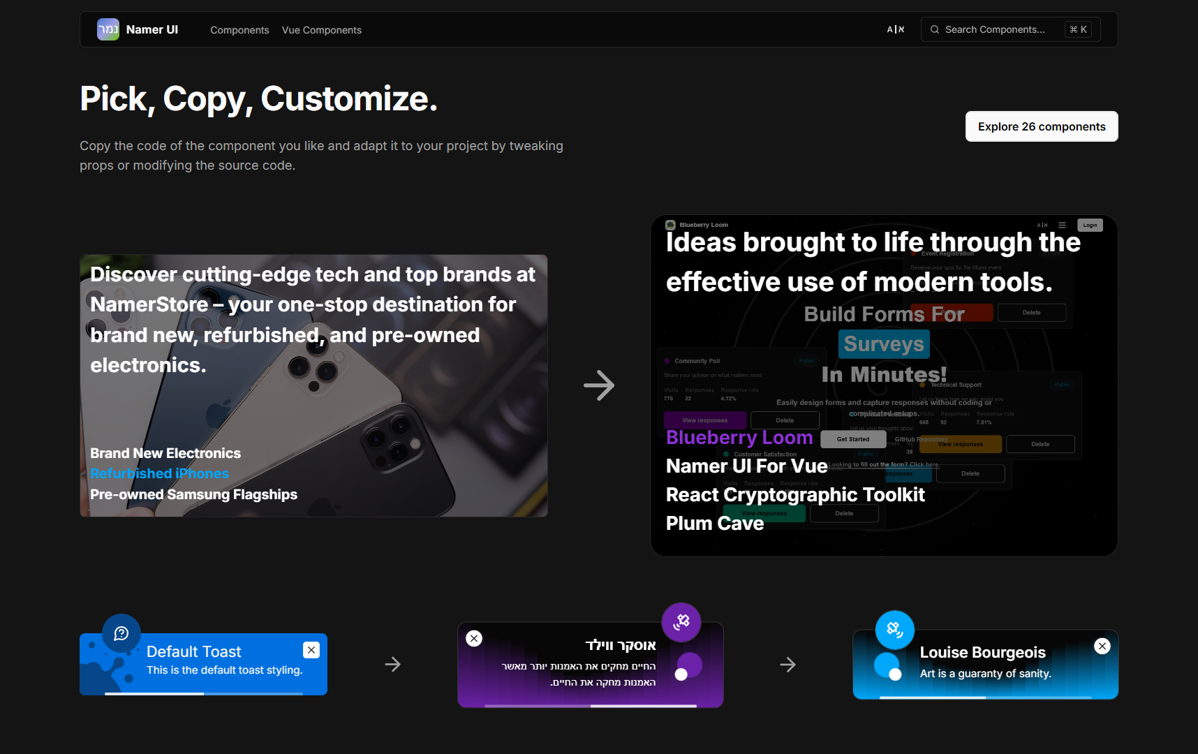
All product names, logos, brand identifiers, and trademarks depicted on the image below are the sole property of their respective owners. These items are used for demonstrational and illustrative purposes only. The Namer UI is not affiliated with, endorsed by, or sponsored by any of the companies whose products are showcased here. This website does not present a commercial offer of any kind. The store name is fictional; any resemblance to existing business(es) is entirely coincidental and unintentional.
Only the credit for the components integrated directly into the app and showcased on the homepage is included below. The existence of this project (at least in its current form) wouldn’t’ve been possible without the following:
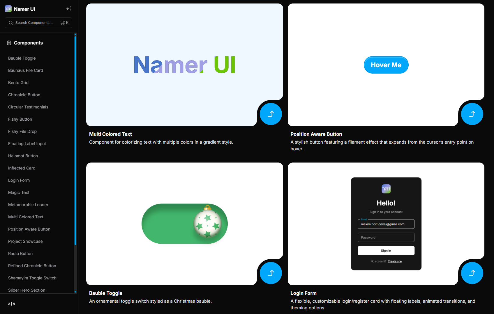
Resizable Navbar by Aceternity UI
Magical Text Effect by Hyperplexed
Cards with inverted border-radius #scss by Kristen
React Wheel Picker by Chánh Đại
Button hover effect by Ana Tudor
すりガラスなプロフィールカード by あしざわ - Webクリエイター
Skeuomorphic Toggle Switch (vol. 2) by Nicolas Jesenberger
Knóbz Skeuomorphic UI Sample for Figma by kolpikov
Splashed Toast Notifications - CSS by Josetxu
Push Notifications by Florin Pop
404 galaxy not found by Rémi Denimal
Modern Hero Section by Ravi Katiyar
Scroll Down Icon Animation by Tsukasa Aoki
Satellite animation by Emile Duval
The credit for each individual component (where applicable) is available on that component’s dedicated page.
Inspired by x/ui