ActionSheet 为操作选单静态类, 一般用于触发一个多项子操作供用户选择, 表现形式为从屏幕下方拖出抽屉。
ActionSheet 基于 Overlay{} 实现。
| Method | Params | Returns | Notes |
|---|---|---|---|
| Overlay methods | ActionSheet 继承 Overlay 的全部静态方法。 | ||
| show | items, cancelItem, options | key | 显示一个操作选单, 重写 Overlay{} 中的同名函数, 输入参数 items 为操作选单项列表, cancelItem(可空)为取消操作项, options(可空)为 ActionSheet.ActionSheetView 其它属性, 参数类型参见 ActionSheetView。 返回唯一的浮层 key 值。 |
| Prop | Type | Default | Note |
|---|---|---|---|
| ActionSheetView | class | ActionSheet 内容显示组件。 |
| Prop | Type | Default | Note |
|---|---|---|---|
| Overlay.PullView props... | ActionSheet.ActionSheetView 组件继承 Overlay.PullView 组件的全部属性。 | ||
| items | array | 操作选单项列表, 数组元素类型为: type ActionSheetItem { title: string, onPress: func, disabled: bool, } |
|
| cancelItem | ActionSheetItem | 取消操作项。 type ActionSheetItem { title: string, onPress: func, disabled: bool, } |
| Prop | Type | Default | Note |
|---|---|---|---|
| Item | class | ActionSheet 操作选单项显示组件。 |
| Prop | Type | Default | Note |
|---|---|---|---|
| TouchableOpacity props... | ActionSheet.ActionSheetView.Item 组件继承 TouchableOpacity 组件的全部属性。 | ||
| type | string | 'default' | 类型。 - default: 默认 - cancel: 取消 |
| title | string number element |
标题, 可以是字符串、数字或 React Native 组件。 | |
| topSeparator | string element |
'none' | 上分隔线, 可以是字符串或 React Native 组件。 - none: 无 - full: 满行分隔线 - indent: 缩进分隔线 |
| bottomSeparator | string element |
'indent' | 下分隔线, 可以是字符串或 React Native 组件。 - none: 无 - full: 满行分隔线 - indent: 缩进分隔线 |
| disabled | bool | false | 继承自 TouchableOpacity, 为 true 时组件显示为半透明且不可触摸。 |
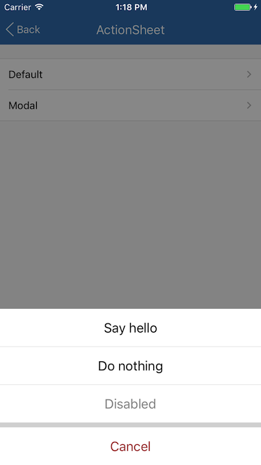
简单用法
let items = [
  {title: 'Say hello', onPress: () => alert('Hello')},
  {title: 'Do nothing'},
  {title: 'Disabled', disabled: true},
];
let cancelItem = {title: 'Cancel'};
ActionSheet.show(items, cancelItem);