 Bootstrap
-
|
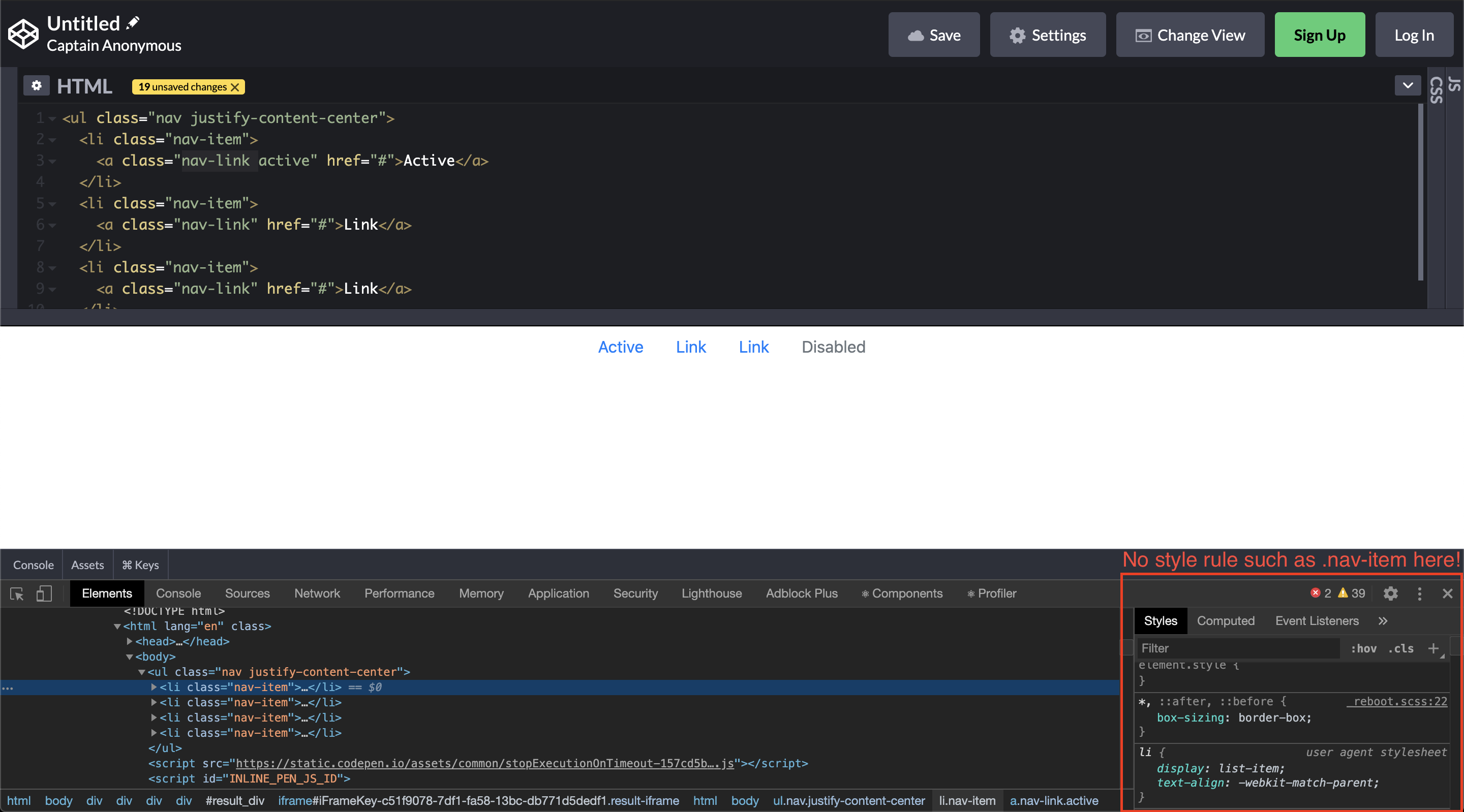
Here is a simple centered nav example: <ul class="nav justify-content-center">
<li class="nav-item">
<a class="nav-link active" href="#">Active</a>
</li>
<li class="nav-item">
<a class="nav-link" href="#">Link</a>
</li>
<li class="nav-item">
<a class="nav-link" href="#">Link</a>
</li>
<li class="nav-item">
<a class="nav-link disabled" href="#" tabindex="-1" aria-disabled="true">Disabled</a>
</li>
</ul>My question is, in order to obtain the same result, why can't I simply: <ul class="nav justify-content-center">
<li>
<a class="active" href="#">Active</a>
</li>
<li>
<a href="#">Link</a>
</li>
<li>
<a href="#">Link</a>
</li>
<li>
<a class="disabled" href="#" tabindex="-1" aria-disabled="true">Disabled</a>
</li>
</ul>I have inspected the output and discovered that no rules apply for the
For nav-link the CSS rule is: .nav-link {
display: block;
padding: .5rem 1rem;
}So, instead of defining a CSS class that needs to be added to every link under a nav, why Bootstrap cannot just: .nav a {
display: block;
padding: .5rem 1rem;
} |
Beta Was this translation helpful? Give feedback.
Replies: 1 comment 2 replies
-
We're verbose because we're explicit. Your above example means that anytime you add another random |
Beta Was this translation helpful? Give feedback.
-
|
But then what's the purpose of |
Beta Was this translation helpful? Give feedback.
-
|
|
Beta Was this translation helpful? Give feedback.
We're verbose because we're explicit. Your above example means that anytime you add another random
<a>element within a<nav>element, it's always going to be block level with that padding. Most of the time, you don't want that. Our approach is class-driven for that reason.