- 请使用3.0.0或更高版本,因为早期版本存在严重的性能问题
- 如果示例不能运行,请查询有关Flutter升级AndroidX的问题, AndroidX Migration - Flutterblock
- 如果在运行您的应用时,提示
Error: Cannot run with sound null safety,请升级版本到4.0.0 参考
Flutter 提示框
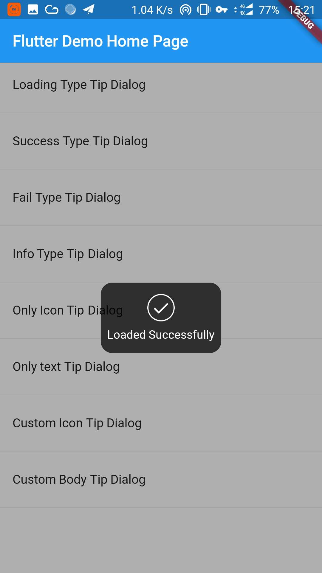
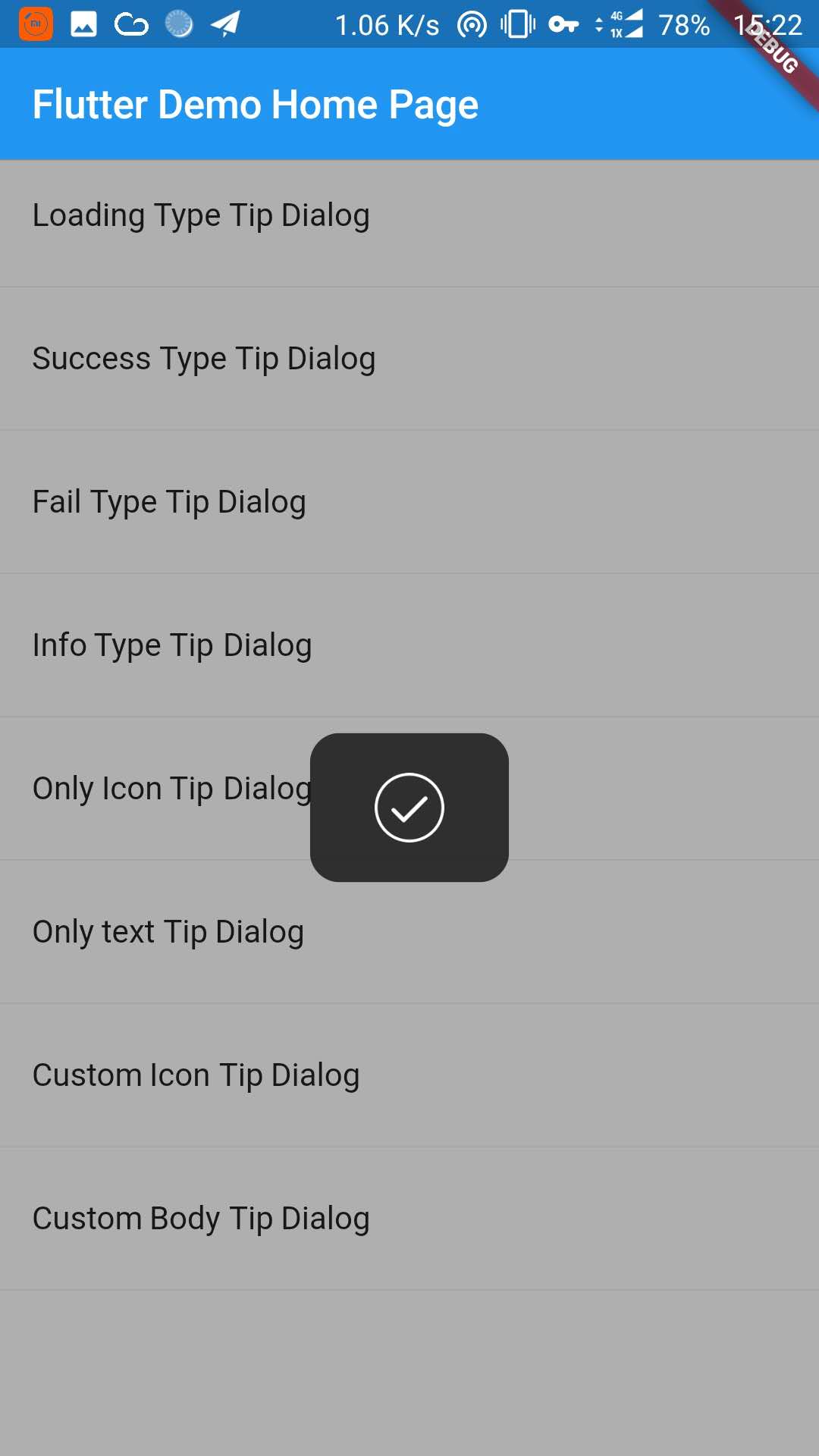
| 加载提示框 | 成功提示框 | 失败提示框 |
|---|---|---|
 |
 |
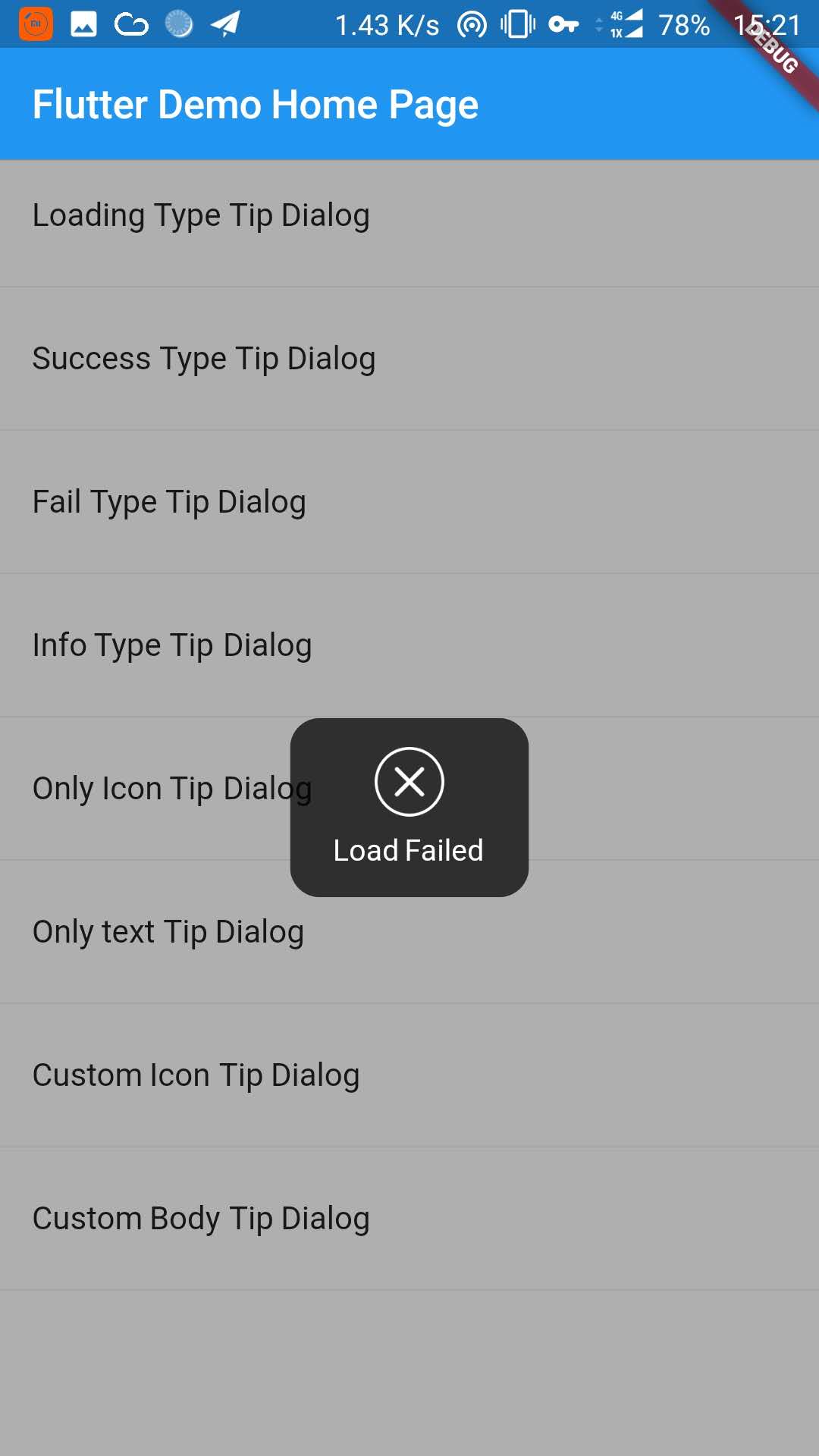 |
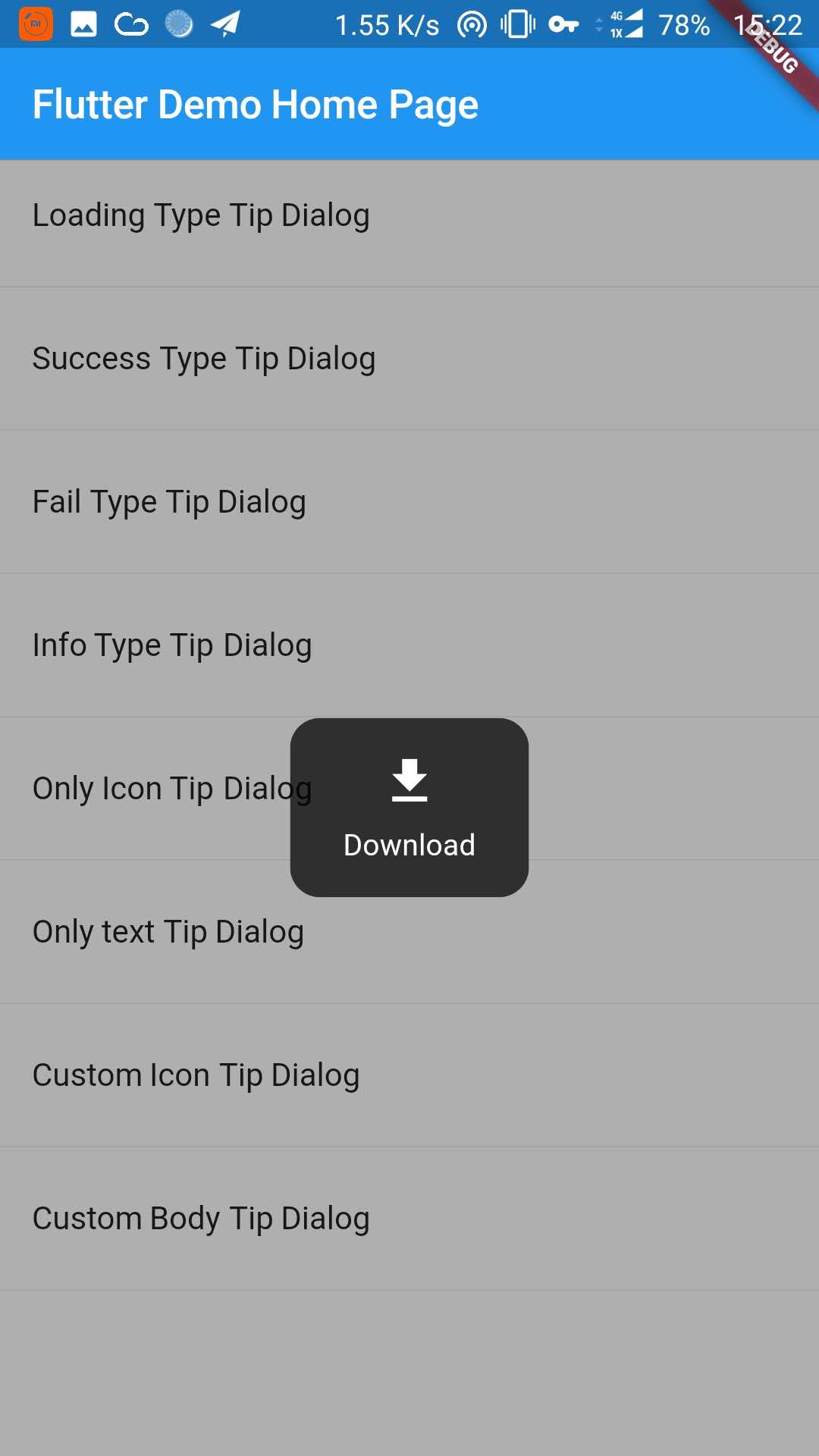
| 信息提示框 | 只有图标的提示框 | 只有文本的提示框 |
|---|---|---|
 |
 |
 |
| 自定义图标提示框 | 自定义提示框 |
|---|---|
 |
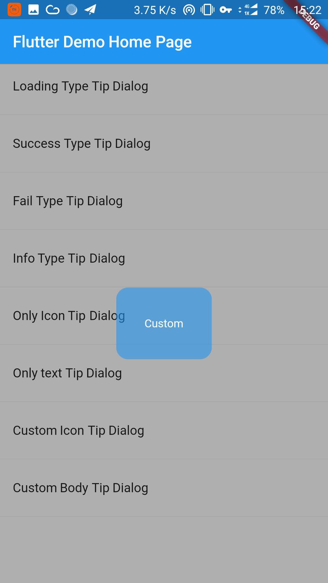 |
添加下面的内容到 pubspec.yaml 文件中:
dependencies:
tip_dialog: ^4.0.0在命令行中使用以下的Flutter命令获取依赖包
$ flutter packages get
import 'package:tip_dialog/tip_dialog.dart';/// [ TipDialogContainer ]
@required this.child,
/// 自动消失的时间
this.duration: const Duration(seconds: 3),
/// 遮罩层不透明度
this.maskAlpha: 0.3
// tip dialog 外部是否可以点击(即遮罩层)
// 如果设置为true并且onOutsideTouch没有设置,那么当使用TipDialogHelper.loading()的时候,你可以点击遮罩层关闭dialog
// 如果设置为true并且onOutsideTouch也设置了,那么当触摸遮罩层的时候,会调用onOutsideTouch方法
this.outsideTouchable: false
// 遮罩层点击回调 {@link OutsideTouchCallback}
this.onOutsideTouch
void main() => runApp(new MyApp());
class MyApp extends StatelessWidget {
@override
Widget build(BuildContext context) {
return new MaterialApp(
title: 'TipDialog Demo',
theme: new ThemeData(),
home: Stack(
children: <Widget>[
MyHomePage(title: 'TipDialog Demo Home Page'),
// 在这里添加 [TipDialogContainer]
TipDialogContainer(duration: const Duration(seconds: 2))
],
),
);
}
}
/// 使用 [TipDialogHelper] 去显示和关闭提示
Widget build(BuildContext context) {
return new Scaffold(
appBar: new AppBar(
title: new Text(widget.title),
elevation: 0.5,
),
body: new ListView(children: <Widget>[
_buildItem("Loading Type Tip Dialog", () async {
TipDialogHelper.loading("Loading");
await new Future.delayed(new Duration(seconds: 5));
TipDialogHelper.dismiss();
}),
new Divider(),
_buildItem("Success Type Tip Dialog", () async {
TipDialogHelper.success("Loaded Successfully");
}),
new Divider(),
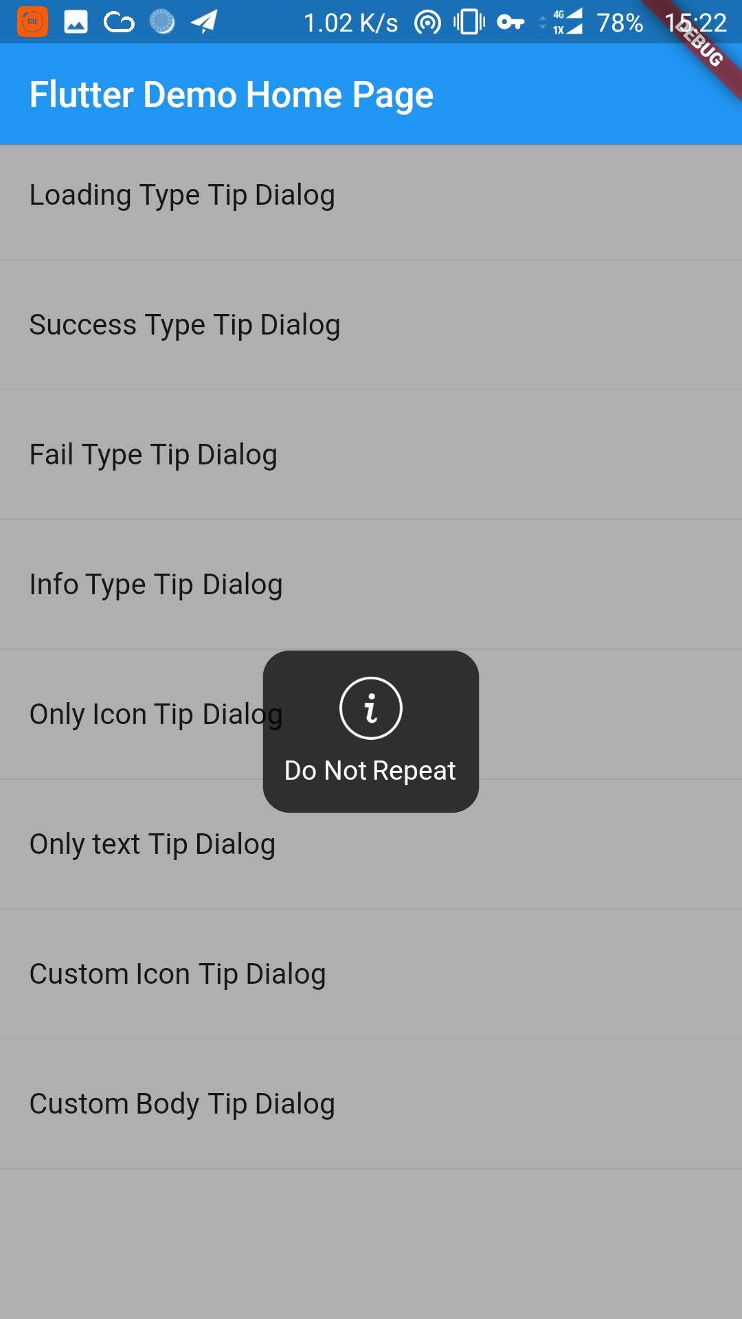
_buildItem("Only text Tip Dialog", () async {
TipDialogHelper.show(new TipDialog(
type: TipDialogType.NOTHING,
tip: "Do Not Repeat",
));
}),
new Divider(),
_buildItem("Custom Icon Tip Dialog", () async {
TipDialogHelper.show(new TipDialog.customIcon(
icon: new Icon(
Icons.file_download,
color: Colors.white,
size: 30.0,
textDirection: TextDirection.ltr,
),
tip: "Download",
));
}),
new Divider(),
_buildItem("Custom Body Tip Dialog", () async {
TipDialogHelper.show(new TipDialog.builder(
bodyBuilder: (context) {
return new Container(
width: 120.0,
height: 90.0,
alignment: Alignment.center,
child: new Text(
"Custom",
style: new TextStyle(color: Colors.white),
/// if TipDialogContainer are outside of MaterialApp,
/// here is a must to set
textDirection: TextDirection.ltr,
),
);
},
color: Colors.blue.withAlpha(150),
));
}),
new Divider(),
]));
}在全局使用自定义控件的使用,可能会出现一些错误 比如使用Text或者Icon的时候,会出现下面的错误.
No Directionality widget found.
这个错误只要在Text或者Icon上设置TextDirection的属性就可以了,具体的细节请到示例中查看.
enum TipDialogType { NOTHING, LOADING, SUCCESS, FAIL, INFO }

NOTHING: no icon
LOADING: have a loading icon
SUCCESS: have a success icon
FAIL: have a fail icon
INFO: have a info icon
CUSTOM: custom tip dialog type, just a sign, do nothing
/// tipDialog: 需要进行显示的提示框
///
/// isAutoDismiss: 这个变量决定了显示出来的提示框是否会自动消失,默认为 true
/// 这个值为false的时候,显示出来的提示框不会自动消失,除非调用dismiss方法
/// 如果这个值是true,那么提示框会在一定时间内消失,这个值是在新建[TipDialogContainer]的时候设置的.
void show(Widget tipDialog, {bool isAutoDismiss: true});

/// 隐藏提示框
void dismiss();
/// 显示失败提示框
void fail(String errMsg);
/// 显示成功提示框
void success(String success);
/// 显示加载提示框
void loading(String loadingTip);
更多细节请参考示例中的代码.
- 升级到空安全
- 添加遮罩层点击功能
- 修复性能问题
- 更加易用
- 添加TipDialogHelper,弃用TipDialogConnector
- 修复dismiss逻辑Bug
- 升级 android build gradle 到 5.1.1
- 设置默认自动消失时间为2s
- 删除 [TipDialogContainer] 部分参数 -- show -- outSideTouchable -- defaultTip -- defaultType
- 改变show方法的isLoading为isAutoDismiss
- 强制显示遮罩层
- 修复无限调用 dismiss 方法的 bug
- 修复 isLoading 无效的问题
- 修复全局使用时出现的错误
- 添加全局支持
- 修复 loading view 的版本 bug
- 设置默认loading时间
- 释放版本