Objective: You should develop a basic understanding on how to create visualizations within SAP Analytics Cloud.
Estimated Time: 35 mins
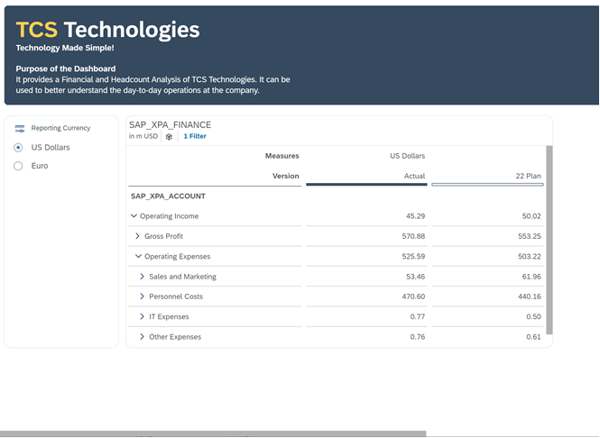
Exercise Description: You and a colleague are building a dashboard for the upcoming board meeting. As a starting point, your colleague has incorporated some Financial Planning Data into the dashboard. You want to further enhance the dashboard to better represent some KPIs while including HR data to get a better understanding on the end-to-end business operations as TCS Technologies.
Key Features:
- Create a set of visualizations (i.e. Chart, Geo, and Table) to illustrate key relationships within your data
- Understand the Builder Panel vs. Styling Panel
- Learn how to create some calculations
🚩As a Business Analyst for TCS Technologies, we are interested in creating a dashboard that incorporates Business Intelligence, Planning, and Scripting. As a starting point, you want to enhance the dashboard that your colleague has started by incorporating HR data.
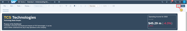
Lets start by editing the dashboard!
- Click Edit
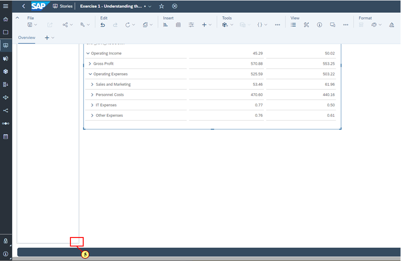
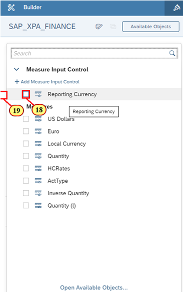
🚩 We can see that based on the current design of the dashboard, the Table and Reporting Currency (Measure Input Control) takes up the entire dashboard. Let's resize a few widgets to make room for some additional visualizations that we want to create.
- Scroll to the bottom of the dashboard
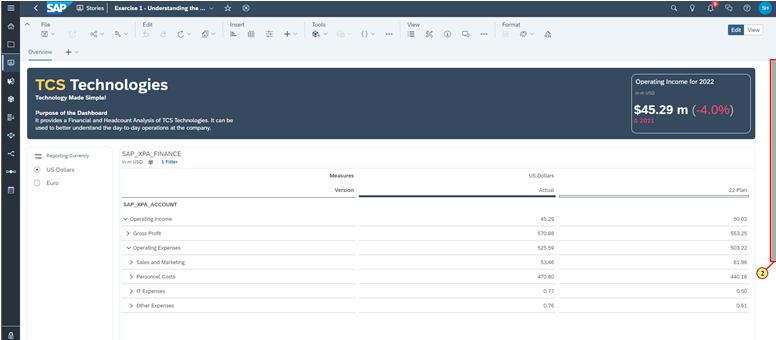
- Click and hold the resize icon in the bottom right of the Table
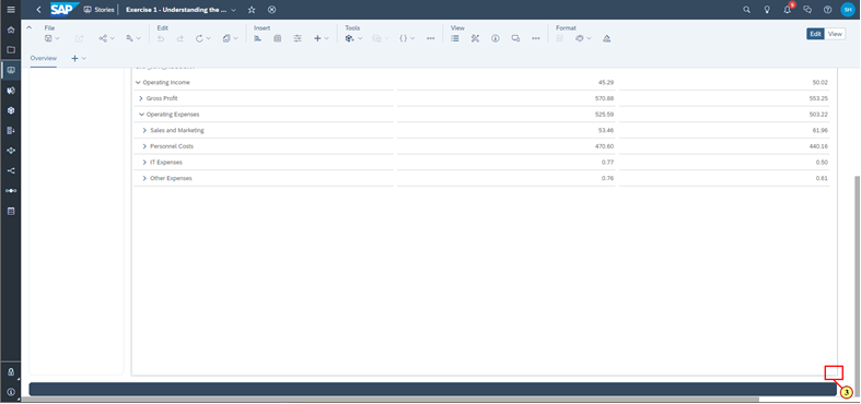
- Resize the Table until it just fits all the Accounts
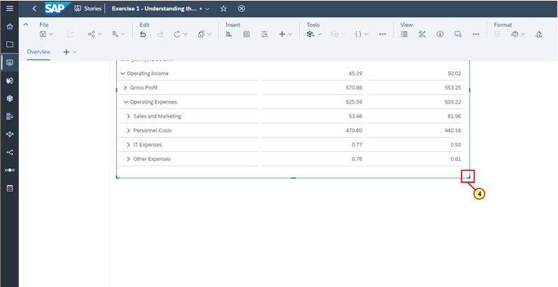
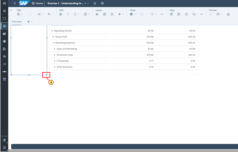
- Click and hold the resize icon in the bottom right of the Reporting Currency Input Control
- Resize the Reporting Currency Input Control so that it has the same height as the Table
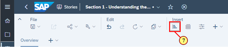
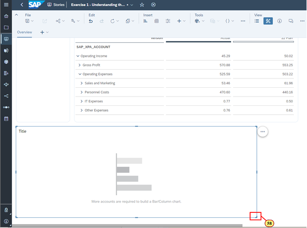
🚩 Now that we have room on our dashboards, let's create our first visualization. We want to provide our colleagues a better understanding of the Gross Profit per Product.
Let's insert a Chart to visualize this information.
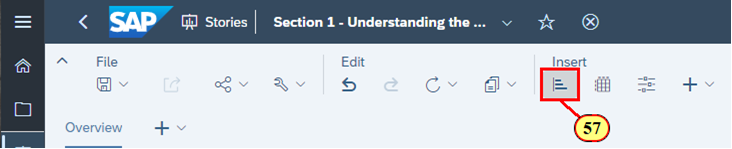
- In the toolbar, click on the Chart icon
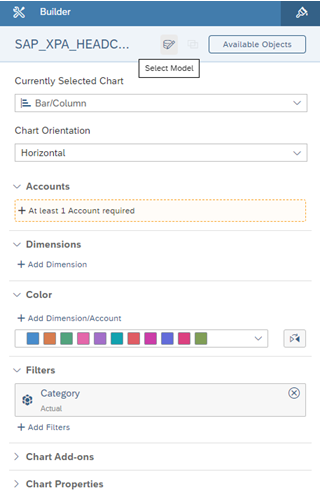
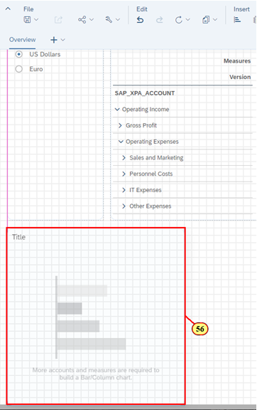
ℹ️ Welcome to the Builder Panel!
The Builder Panel is a place where you can create your visualizations by specifying elements of a visualization such as accounts, measures, dimensions, filters and so on. The Builder Panel will dynamically update depending on the Data Model and the type of visualization that you are creating.
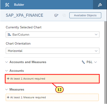
For this Chart, we want to use SAP_XPA_FINANCE as our data model, which is a New Model type. The Chart requires at least one Account and at least one Measure to be selected from the Builder Panel.
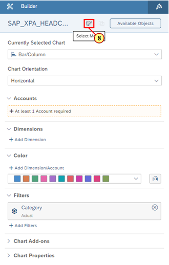
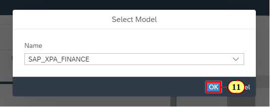
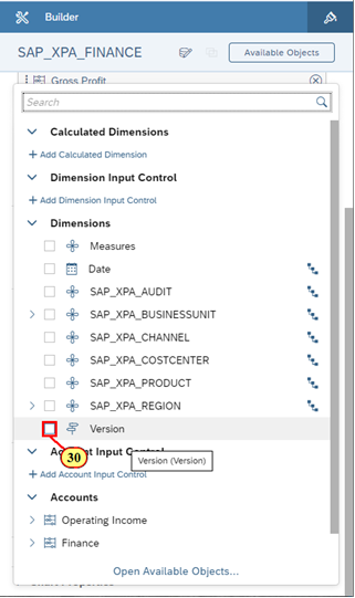
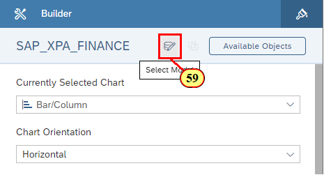
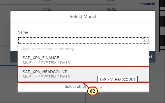
🚩 In the Builder Panel, we can see that the current data model that is being used in the Chart is SAP_XPA_HEADCOUNT. In order to incorporate financial data into the Chart, you will need to change the Data Model for this Chart.
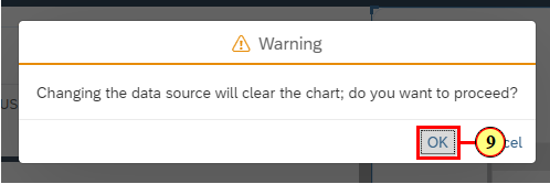
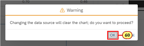
- Click on the Data Model icon
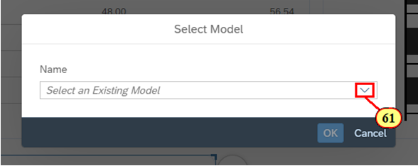
- Click OK
- Click SAP_XPA_FINANCE
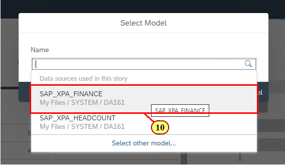
- Click OK
🚩 After selecting the Finance Data Model, the Builder Panel automatically updates the name of the Data Model.
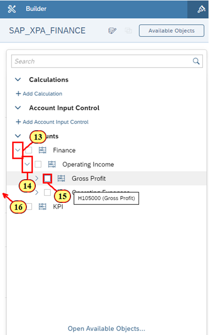
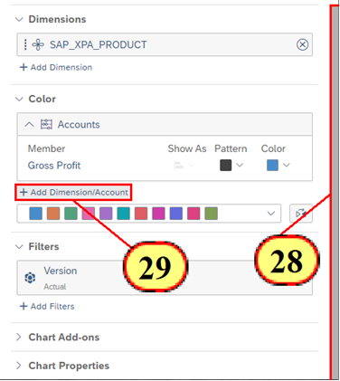
- Click + At least 1 Account required
- Click on the arrow beside Finance to expand the Account
- Click on the arrow beside Operating Income to expand the Account
- Click on Gross Profit
- Click anywhere outside the Account selection dropdown menu to collapse it
- Click + At least 1 Measure required
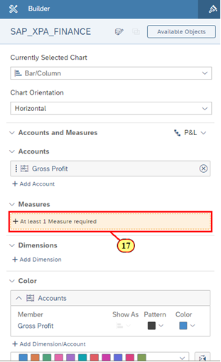
- Click Reporting Currency
- Click on a spot outside the Measures selection dropdown menu to collapse it
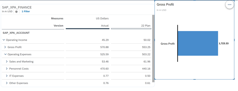
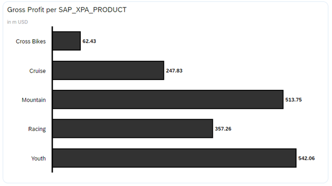
🚩 We can now see data for our Gross Profit as we've successfully met the minimum conditions to view data for our Bar / Column Chart. Let's now add our Product dimension to see the breakdown per Product.
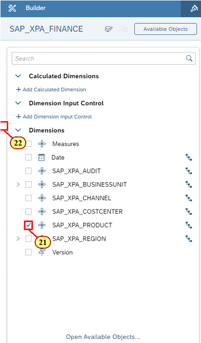
- Click + Add Dimension
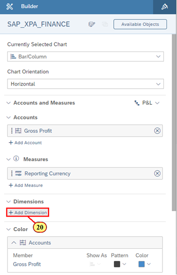
- Click SAP_XPA_PRODUCT
- Click anywhere outside the Dimension selection dropdown menu to collapse it
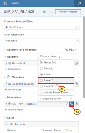
🚩 However, as Product is a hierarchial dimension, we want to drill down into the Product Dimension so that we can see a more detailed view of our Gross Profit.
- Let's try drilling via the Builder Panel. Click the Drill icon in the SAP_XPA_Product Dimension.
- Click on Level 2
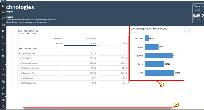
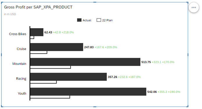
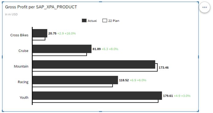
🚩 We can now see data for our Gross Profit per Product. Based on this breakdown, we can see that Youth Bikes bring us the most Gross Profit in comparison to any other product that we offer.
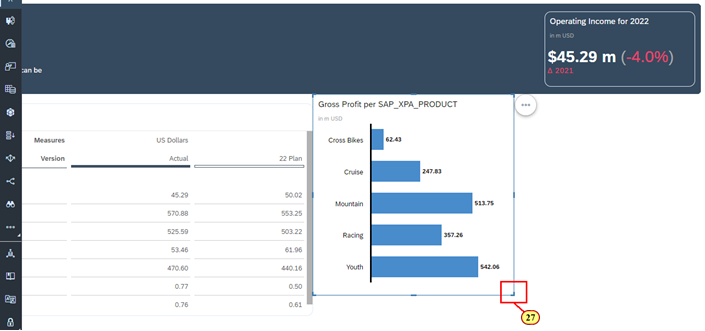
Let's resize and reposition the visualization for better readability.
- Scroll to the right of the dashboard
- Click and hold the border of the Chart to move the Chart to align it with the top of the Table
- Click and hold the bottom right resize icon for the Chart. Resize the Chart to align it with the table and the edge of the shape header.
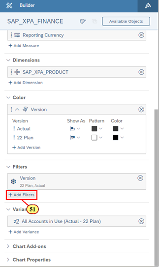
🚩 Now, the Chart only shows actual Gross Profit. We want the Chart to show actual Gross Profit versus planned Gross Profit. We will add planned Gross Profit into the Chart by adding an additional Dimension.
- Scroll to the bottom of the Builder Panel
- Click + Add Dimension/Account
- Click Version
ℹ️ International Business Communication Standards (IBCS)
The color of the Chart is now changed to black for actual Gross Profit. This is because SAP Analytics Cloud is following International Business Communication Standards (IBCS), so we are coloring the bars based on the color of the Version that is added to the Chart. Now that we have actual Gross Profit in our Chart, we want to add planned Gross Profit.
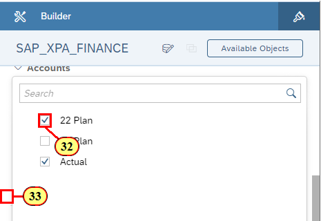
- Click + Add Version
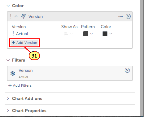
- Click 22 Plan
- Click on a spot outside the Version selection dropdown menu to collapse it
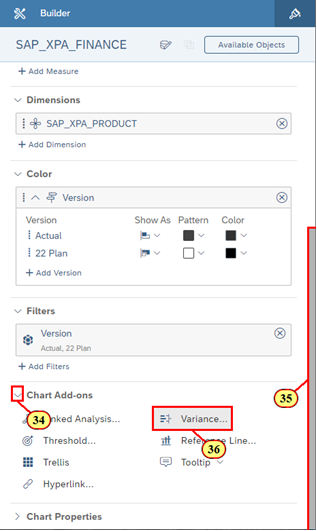
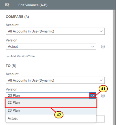
🚩 We can see the difference between our Plan 22 and Actuals. However, we want a better visual representation of this data. Hence, lets add a variance to show the difference between Actual and 22 Plan.
- Click the expand icon for Chart Add-ons
- Scroll to the bottom of the Builder Panel
- Click Variance
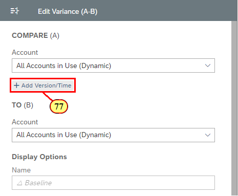
- Click + Add Version/Time

- Click Version
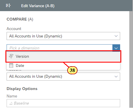
- For Compare (A), click the expand icon for Version
- Click Actual
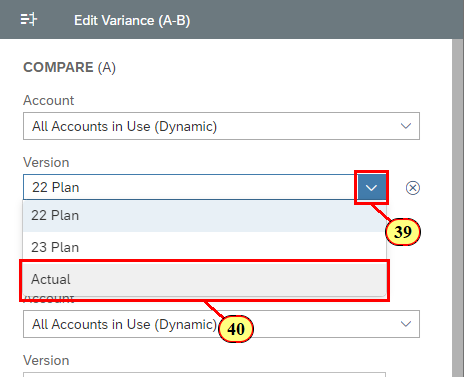
- For To (B), click the expand icon for Version
- Click 22 Plan
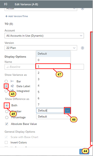
- Click Data Label
- Scroll to the bottom of the Variance Panel
- Click Both
- Click the expand icon for Number
- Select 1 to set the decimal precision for the numeric variance
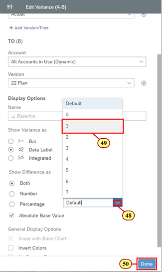
- Click the expand icon for Percentage
- Select 1 to set the decimal precision for the percentage variance
- Click Done
🚩 Press CTRL + S to save your story.
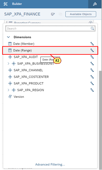
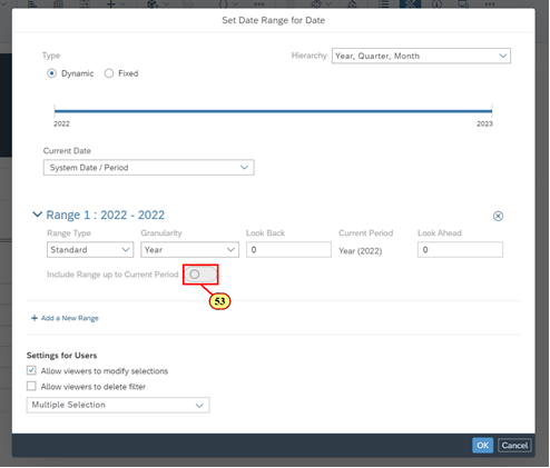
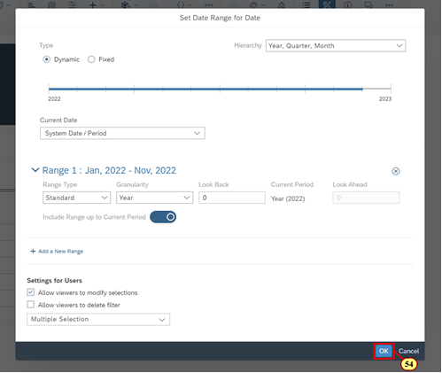
🚩 To ensure that we are comparing 22 Plan with 22 Actual instead of Actual financial data for all years, let's add a filter so that we are setting a date range for current year (2022) values through the current period.
- Click + Add Filters
- Click Date (Range)
- Click the toggle to enable the ability to include range up to the current period
- Click OK
🚩 We now have a good representation of some key figures when it comes to our financial data. Now, let's incorporate some Headcount data into our dashboard to provide our management team a holistic view of the business.
- In the toolbar, click on the Chart icon
- Click and hold the border of the chart to move the object and position it to align with the Reporting Currency Input Control.
- Click and hold the bottom right resize icon of the Chart
- Resize the Chart so that its width is slightly smaller than the Table above
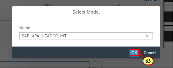
🚩 We can see that the current data model that is being used in the Chart is SAP_XPA_FINANCE. In order to incorporate Headcount data into the Chart, you will need to change the Data Model for this Chart.
- Click the Data Model icon
- Click OK
- Click on the arrow
- Click SAP_XPA_HEADCOUNT
- Click OK
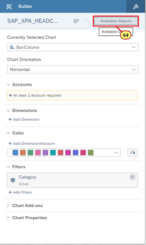
🚩 After selecting the Headcount Data Model, the Builder Panel automatically updates the name of the Data Model. For the Headcount Data Model, it is a Classic Account Model instead of a New Model that we saw for the Finance Data Model. Therefore, the Builder Panel is updated to reflect how Account is the only requirement for the Classic Account Model.
You are not too familiar with the Headcount Data Model and you want to see a list of Accounts and Dimensions that are available to insert into the Chart. In the top right of the Builder Panel, click Available Objects.
- Click Available Objects in the Builder Panel
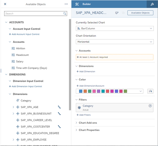
ℹ️ Welcome to the Available Objects!
It provides you a holistic view of all the data-related objects that are associated to the data model. It provides you with an ability to quickly drag and drop objects into the Builder Panel or use any of the quick action menus to bind the data.
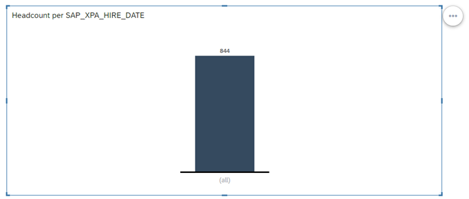
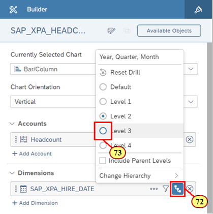
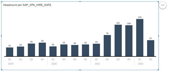
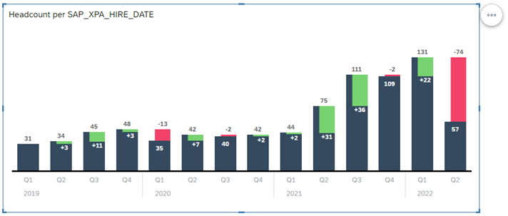
🚩 Based on the data that is available within this data model, we are interested in building a trend over time that represents our headcount.
- Click on the More action icon ("...") for Headcount
- Click Add to Accounts
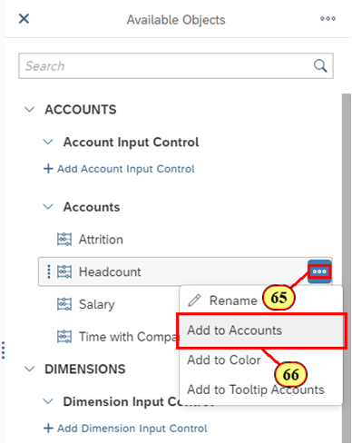
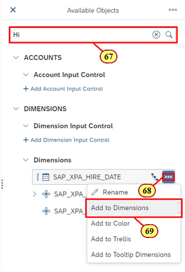
- Click on the search bar and type Hire
- Click on the More action icon ("...") for SAP_XPA_HIRE_DATE
- Click on Add to Dimensions
- Click on the bar that represents (all)
- Click on the Drill Down icon
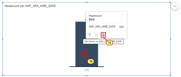
- Within the Builder Panel, click on the Drill icon for SAP_XPA_HIRE_DATE
- Click Level 3
- Scroll to the bottom of the Builder Panel
- Click expand for the Chart Add-ons
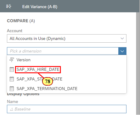
- Click Variance
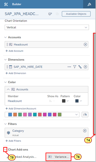
- Click + Add Version/Time
- Click SAP_XPA_HIRE_DATE
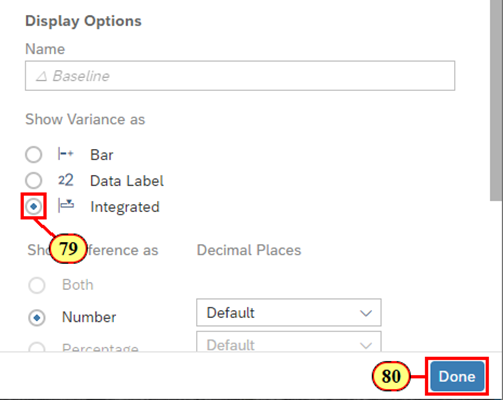
- Click Integrated
- Click Done
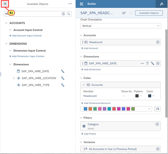
- Click X to close the Available Objects List
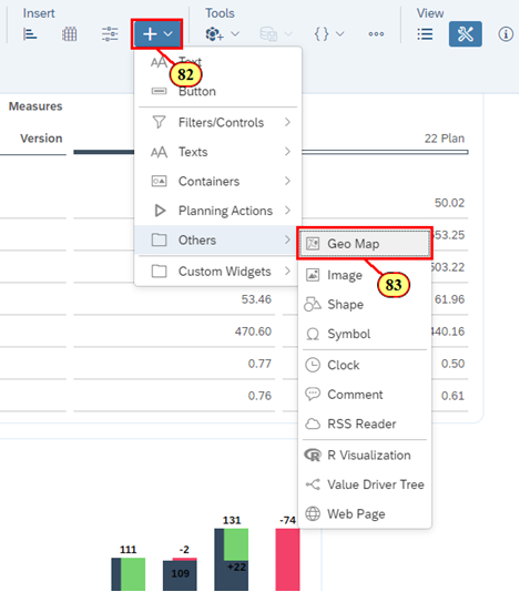
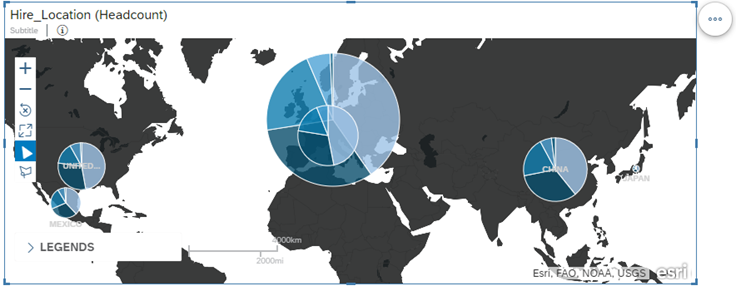
🚩 We now want to add a Geographical representation of where the hires are per location. It would also be a good idea for us to better understand the various career levels that we have by headcount per location.
- Click the Add icon
- Click Geo Map in the Others section
- Click and hold the border of the Geo Widget to move the object
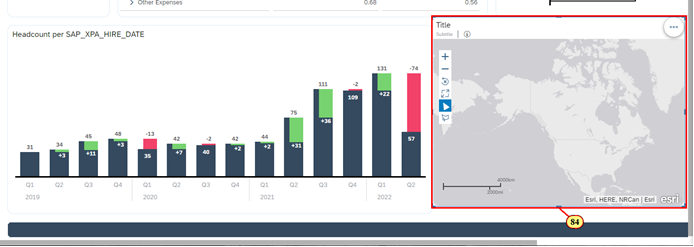
- Move the Geo Widget to align it with the top of the Chart
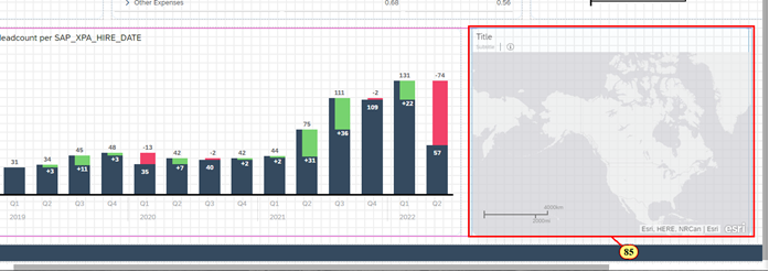
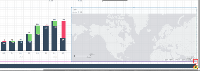
- Resize the Geo to align it with the Chart above and the edge of the shape header
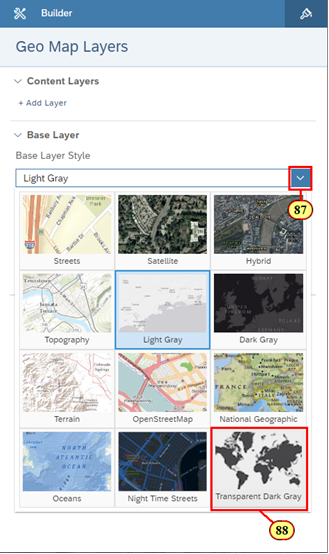
🚩 We want to change the Base Layer Style to better match the theme of the rest of the dashboard.
- Click Light Gray to open the dropdown menu to see other Base Layer Styles
- Click Transparent Dark Gray
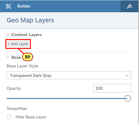
- Click + Add Layer
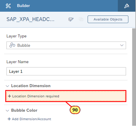
- Click + Location Dimension required
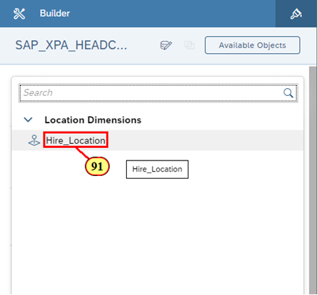
- Click Hire_Location
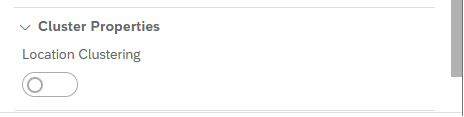
ℹ️ Location Clustering in Geo Visualization! Adding a Location Dimension will determine whether or not Location Clustering in the Builder Panel will continue to be turned on or automatically turned off. It will be turned off if you have less than 5000 data points. In this example, Location Clustering is automatically turned off in the Builder Panel.
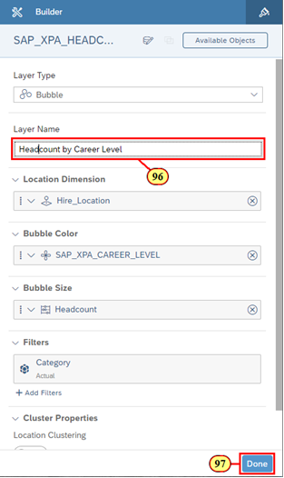
🚩 We can now see data points for all our hire locations in the Geo Map. Let's add Headcount and Career Level as the size and color respectively to further drill down into our data.
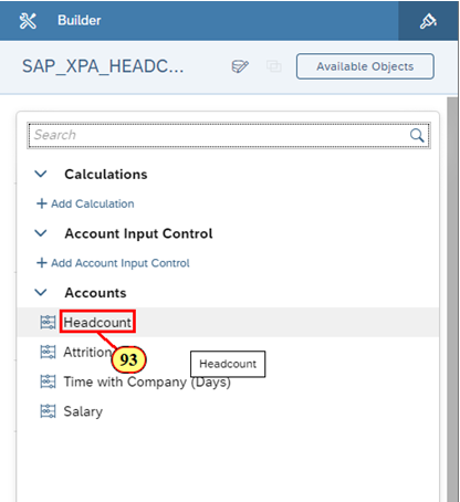
- Under Bubble Size, click + Add Account
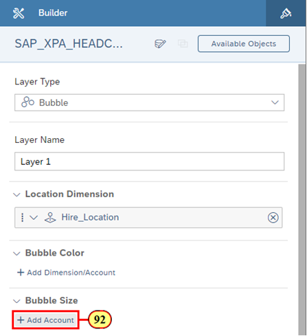
- Click Headcount
- Under Bubble Color, click + Add Dimension/Account
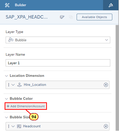
- Click SAP_XPA_CAREER_LEVEL
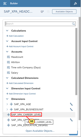
- Rename the Layer Name to Headcount by Career Level
- Click Done
🚩 Press CTRL + S to save your story.
🚩 We are now interested in adding another KPI to summarize the Average Salary that we are paying our employees. To make it easier, let's duplicate the existing KPI so that we don't need to worry much about the formatting of the object.
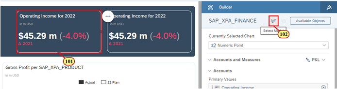
- Click on the Numeric Point Chart for Operating Income for 2022
- Click the More Action icon
- Hover over Copy and select Duplicate
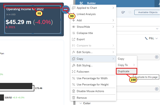
- Move the object besides Operating Income for 2022
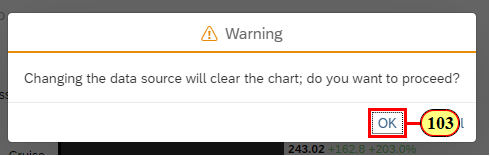
- Click on the Data Model icon
- Click OK
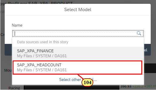
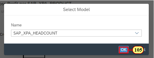
- Click SAP_XPA_HEADCOUNT
- Click OK
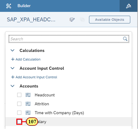
- Click + At least 1 Account required
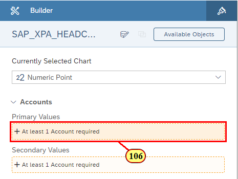
- Click Salary
🚩 After clicking Salary, we realize that the KPI shows the total salary that was ever paid to employees. This KPI doesn't show Average Salary per Employee, which is what we want to see in the KPI.
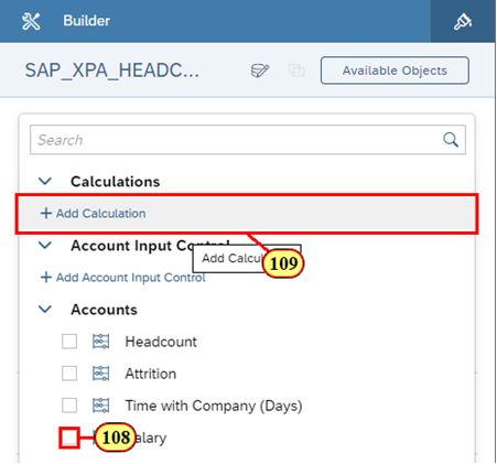
Hence, we will have to create a calculation to reflect this metric.
- Deselect Salary
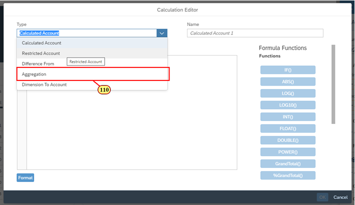
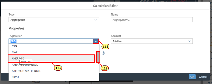
- Click Add Calculation
- Click Aggregation
- Click the Expand icon for Operation
- Scroll down till you see Average
- Click Average
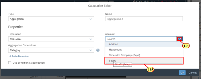
- Click the Expand icon for Account
- Click Salary
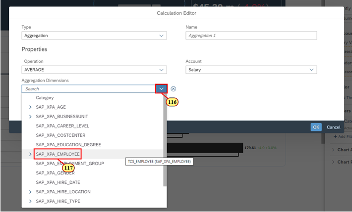
- Click the Expand icon for Aggregation Dimensions
- Click SAP_XPA_EMPLOYEE
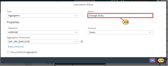
- Rename the calculation to Average Salary
- Click OK
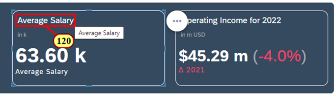
- Rename the Title to Average Salary
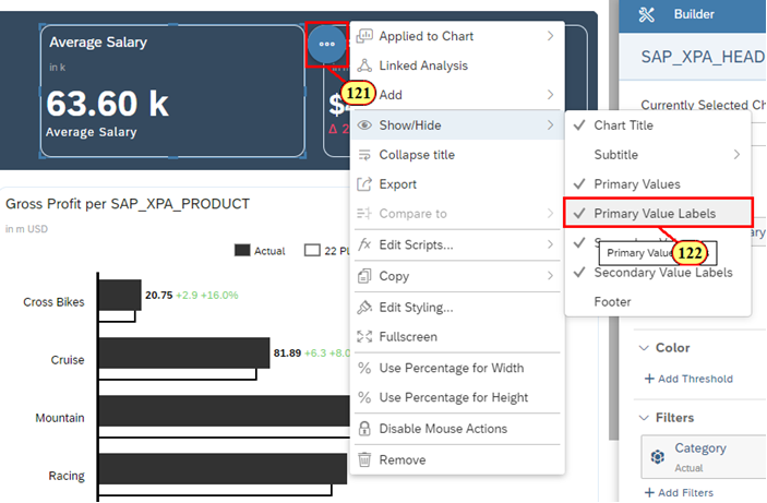
- Click the More Action icon
- Hover over Show / Hide and deselect Primary Value Labels
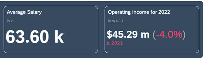
🚩 Press CTRL + S to save your story.
You have completed the entire Understanding the Basics of SAP Analytics Cloud Stories section!
You are now able to:
- Create a set of visualizations (i.e. Chart, Geo, and Table) to illustrate key relationships within your data
- Understand the difference between the Builder Panel vs. Styling Panel
- Create a set of basic calculations
- Include Chart Add-ons, such as a Variance
Continue to - Exercise 2 - Integrating Planning into a Business Intelligence Story